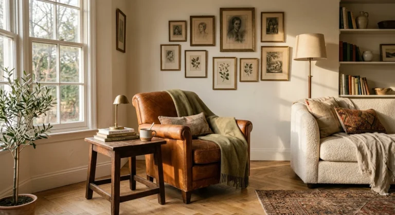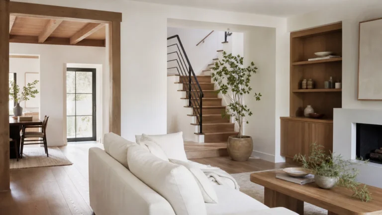
Stepping into a home filled with historical character instantly transforms how you experience a space, but choosing the right palette often feels intimidating. By borrowing proven color combinations from past design eras, you eliminate the guesswork and anchor your rooms in time-tested visual harmony. Whether you want to restore original architectural trim with Victorian jewel tones or modernise a rented apartment using mid-century pastels, classic schemes deliver immediate depth and personality. You do not need an interior design degree or a massive remodeling budget to execute these historic color trends effectively. With a few swatch tests, basic surface preparation, and quality paint, you can easily reinvent your walls, cabinetry, or accent furniture this weekend.
Planning Your Historical Color Transformation
Before you crack open a paint can, evaluate your project scope, budget, and timeline. Decorating with vintage inspired color schemes requires minimal specialized equipment, making this an ideal project for DIYers. A standard room transformation costs between $75 and $180, depending on paint grade. Allocate four to six hours over a single weekend for application. As highlighted in design overviews on Architectural Digest, historic colors gain richness from pigments that absorb light differently than modern stark whites. You only need basic tools: a quality two-inch angled brush, a nine-inch roller, painter’s tape, surface cleaner, and medium-grit sandpaper. Planning your layout around architectural features like baseboards or picture rails amplifies the historic aesthetic.
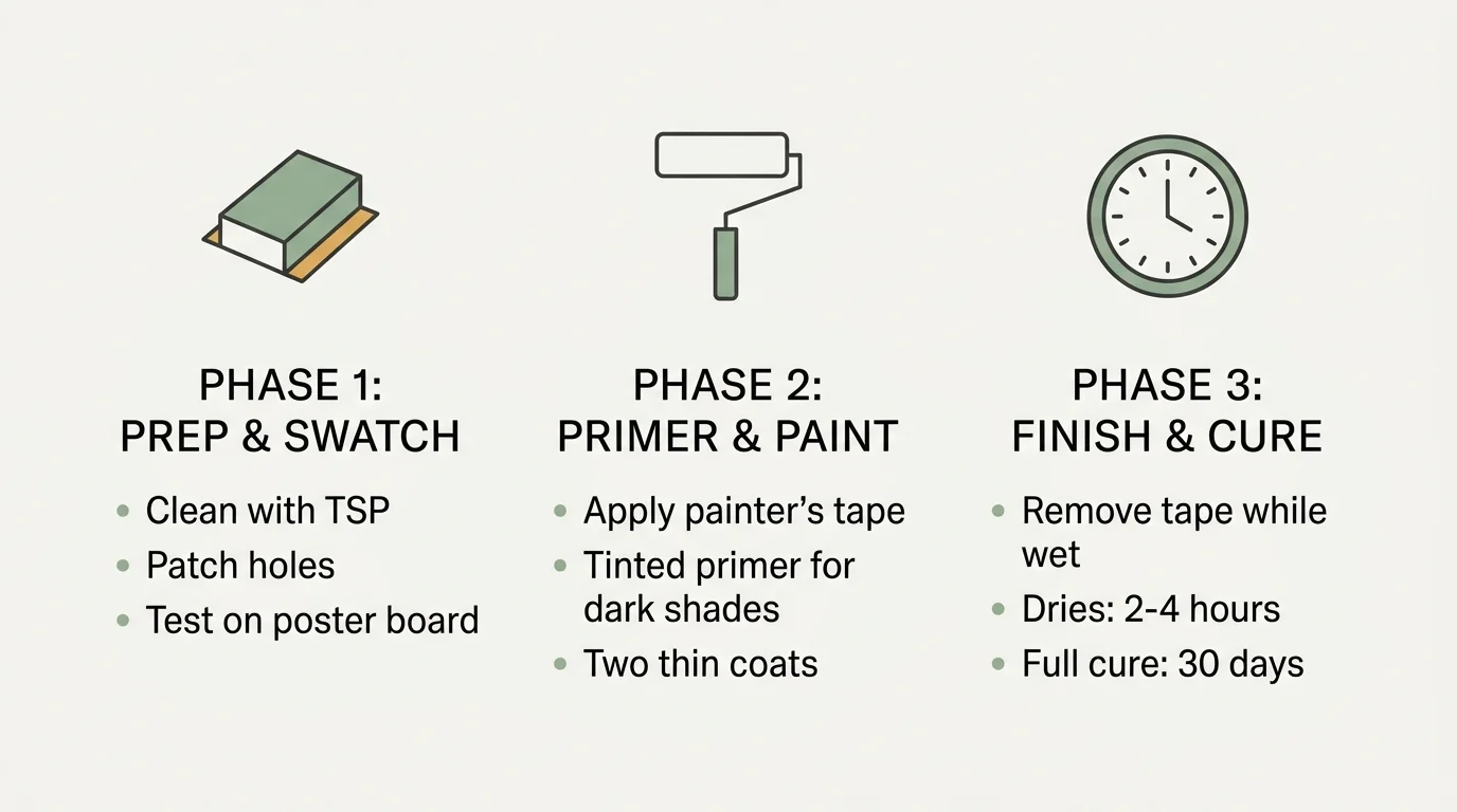
The Three-Phase Painting Framework
Phase 1: Preparation and Swatch Testing
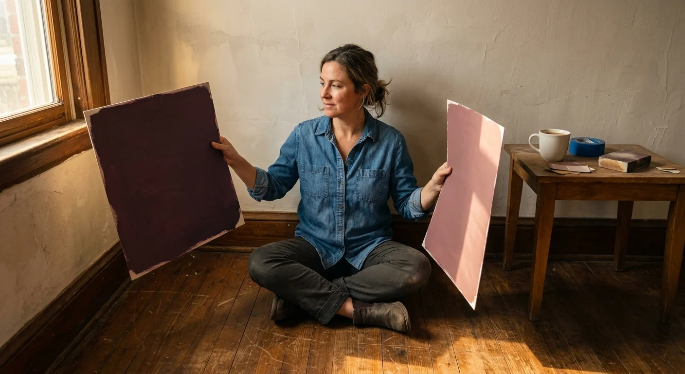
Skipping surface preparation compromises even the most elegant historic design era color trends. Clean your walls thoroughly with trisodium phosphate or a mild soap solution to remove oils. Patch nail holes with spackle, sand those spots smooth using 120-grit sandpaper, and wipe away residual dust with a microfiber cloth. Sample your prospective palette on large poster boards. Move these boards around your room to observe how changing daylight alters shade perception. Check reflective quality as well, consulting U.S. Department of Energy energy efficiency guidelines to see how lighter sheen choices maximize ambient light.
Phase 2: Strategic Primer and Application
Apply painter’s tape firmly along trim edges, pressing with a putty knife to prevent bleed-through. If you shift from a light wall shade to a dramatic throwback color combination—such as Victorian plum or 1920s matte black—apply a tinted primer first. Tinted primer builds an even base coat and saves extra topcoats. Cut in around edges using your angled sash brush before rolling central wall areas. Work in three-foot sections, maintaining a wet edge to avoid lap marks. Apply two thin coats rather than one heavy layer to prevent sags.
Phase 3: Precision Finishing and Curing
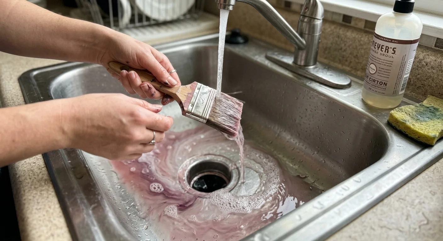
Remove painter’s tape while the second coat remains slightly wet to pull clean lines without tearing dried paint film. Paint dries to the touch in two to four hours, but full curing takes up to thirty days. Avoid scrubbing walls or hanging heavy artwork during this initial cure window. Wash your brushes in warm soapy water immediately after painting to preserve their shape.
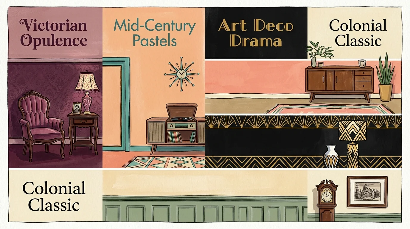
8 Color Combinations Borrowed From Past Design Eras
1. Deep Plum and Dusty Rose: Victorian Opulence
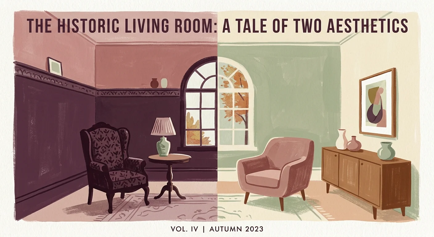
Victorian interior decor relied on saturated, moody tones that created cozy living spaces. Pairing a rich plum with soft dusty rose delivers high-contrast sophistication without feeling overly stark. Use deep plum on lower wall areas, trim, or wainscoting to weight the room visually; coat upper walls in dusty rose to keep ambient light soft. This duo works exceptionally well in dining rooms or entryways. Complement this combination with brass hardware and warm velvet textiles to enhance its tactile luxury.
2. Ochre Yellow and Forest Green: Arts and Crafts Authenticity
The Craftsman movement at the turn of the twentieth century emphasized natural materials and grounded earth pigments. Combining rich ochre yellow with a deep forest green bridges the gap between indoor architecture and outdoor landscapes. Apply forest green to built-in shelving, fireplace surrounds, or doors, while running warm ochre yellow across main wall surfaces. According to color restoration features on HGTV home restoration guides, earth-toned palettes accentuate stained oak trim without overpowering small architectural details.
3. Jade Green and Matte Black: 1920s Art Deco Glamour
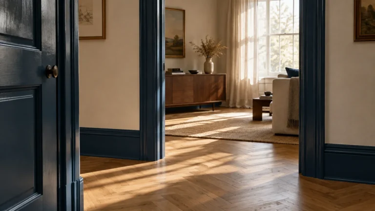
The roaring twenties introduced striking geometric patterns, metallic accents, and high-contrast choices. Jade green paired with crisp matte black yields a lavish yet disciplined look. Paint your walls in a smooth mid-tone jade green, then use matte black on window sashes, baseboards, or doors to construct strong architectural framing. This combination provides a stunning backdrop for polished chrome, mirrored furniture, and graphic artwork. It excels in powder rooms or smaller spaces where bold choices create maximum visual impact.
4. Mint Green and Flamingo Coral: 1950s Mid-Century Optimism
Post-World War II interiors embraced breezy pastels that reflected optimism and modern domestic life. Mint green paired with flamingo coral creates an energetic, joyful environment that feels refreshingly bright. Use mint green as your primary wall backdrop, applying coral pink to accent furniture, painted cabinetry, or kitchen islands. Temper the sweetness of these pastels by introducing clean white trim and light birch or walnut wood furnishings, keeping the look fresh rather than overly nostalgic.
5. Avocado Green and Mustard Yellow: 1960s Earthy Retro
The late 1960s ushered in a swing toward organic hues, groovy patterns, and casual comfort. Combining avocado green with warm mustard yellow brings a cheerful retro energy into contemporary floor plans. To keep this throwback color combination feeling modern, select desaturated versions of both shades. Paint three walls in a neutral creamy off-white, then designate one wall for an avocado green backdrop accentuated by mustard yellow furniture, lamps, or ceramics. This balance prevents colors from overwhelming your room.
6. Terracotta and Chocolate Brown: 1970s Warm Rustic
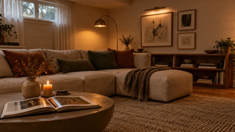
The 1970s prioritized warm, tactile environments dominated by natural earth tones and textured fabrics. A scheme featuring baked terracotta and rich chocolate brown establishes an inviting atmosphere. Paint your living room walls in a matte terracotta finish, reserving deep chocolate brown for wooden beams, trim, or plush upholstery. Terracotta contains subtle red and orange undertones that warm up cool northern sunlight, making this combination particularly effective for chilly or window-starved rooms.
7. Teal and Soft Blush: 1980s Postmodern Flare
Eighties design moved away from muted earthiness toward striking jewel tones and graphic styles. Pairing rich teal with soft blush pink generates a compelling balance of cool strength and warm gentleness. Coat your bedroom walls in a soothing blush tone, using saturated teal on an upholstered headboard, accent chairs, or doors. This vibrant pairing feels deeply custom, especially when you layer in sleek glass lighting fixtures and metallic gold accents across the space.
8. Sage Green and Warm Oat: 1990s Organic Neutrality
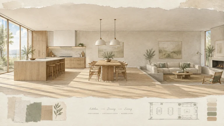
The 1990s marked a sharp return to quiet minimalism, muted earth tones, and calming textures. Combining muted sage green with a warm oat neutral creates a restorative palette that suits open-concept spaces. Use warm oat on expansive living room walls to maximize daylight, while painting kitchen cabinets or vanities in tranquil sage green. Modern research summarized in university extension services publications shows that soft green hues promote focus and stress reduction, making this combination perfect for bedrooms.
Styling and Personalizing Vintage-Inspired Schemes
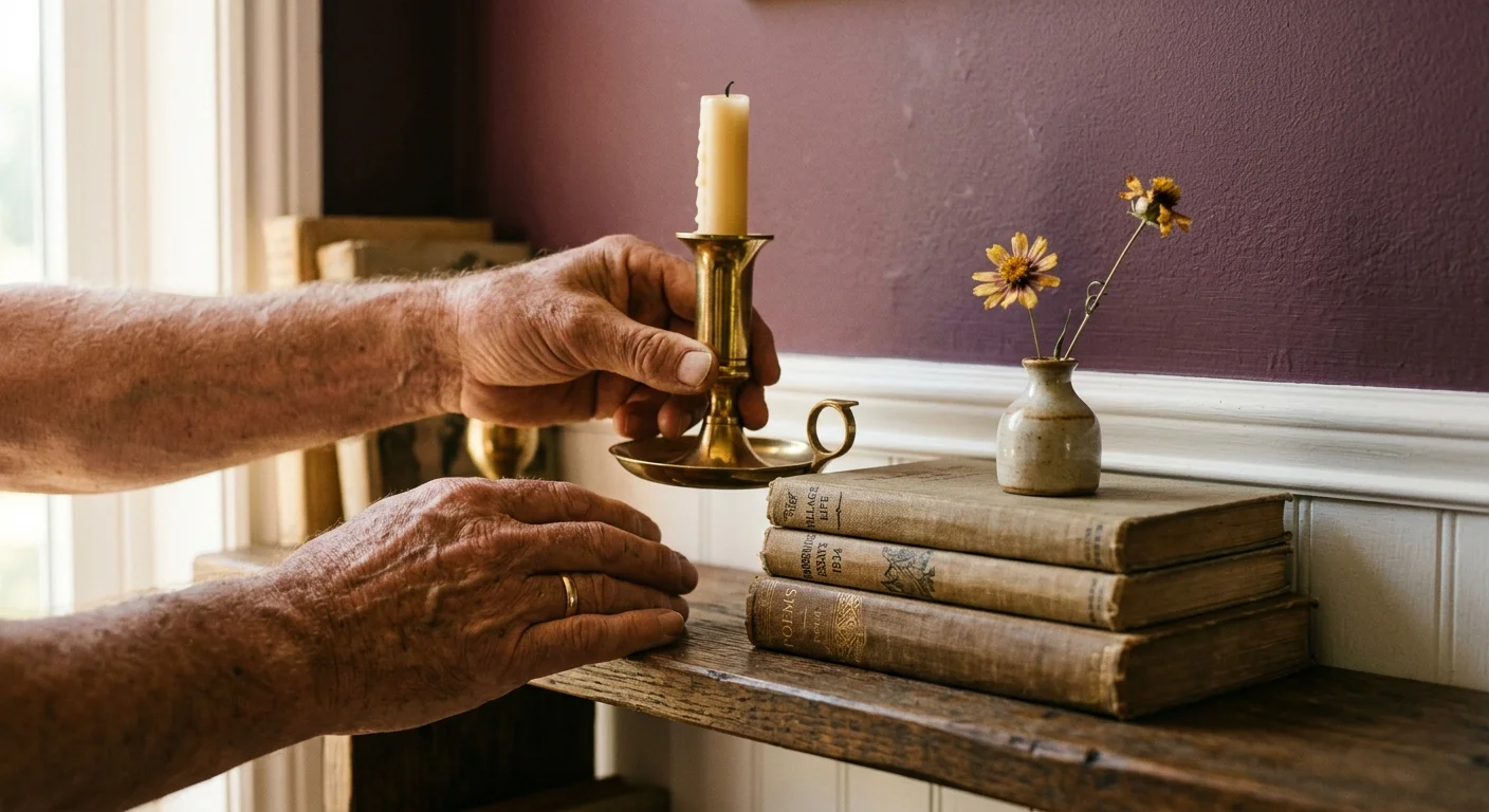
To prevent retro color palette ideas from feeling like a museum period piece, balance vintage colors with contemporary furnishings and clean lines. Follow the classic 60-30-10 design rule: devote 60 percent of your room to your primary background hue, 30 percent to a secondary structural color, and 10 percent to an accent tone. Mix textures to create visual richness without adding clutter. Combine smooth painted surfaces with natural woven linen, warm timber, matte ceramics, and brushed metal hardware. If you live in a rented apartment, apply these historical color combinations to freestanding bookshelves, dining chairs, or large painted canvases to enjoy vintage flair without risking your deposit.
Troubleshooting and Upkeep Guidelines
If paint bleeds beneath your tape lines, let the area dry completely before touching it up with a small artist brush and your base coat color. Mismatched undertones frequently cause dissatisfaction; a color that looks warm under store lighting may appear cool under your home’s 4000K LED bulbs. Always test swatches against your existing flooring and furniture before committing to full wall coverage. Maintain your newly painted walls by wiping them clean with a soft microfiber cloth and mild soap solution. Avoid abrasive scrub pads that scuff low-sheen historic finishes. Keep leftover paint sealed tightly in a cool place for touch-ups.
Frequently Asked Questions
How do I test retro color combinations without painting directly on my walls?
Paint two coats of sample colors onto white poster board or stick-on sample sheets. Move these sheets around your room to see how artificial and natural lighting alter the pigments against your furniture.
Can renters implement vintage inspired color schemes?
Yes, renters can easily adapt these combinations by painting removable furniture, applying peel-and-stick backdrop wallpapers, or using large painted canvases. You can also incorporate historic palettes through throw blankets, area rugs, and window drapery.
What paint sheen works best for historic design era color trends?
Flat, matte, or eggshell finishes deliver an authentic historic look on walls because traditional paints lacked high-gloss polymers. Use satin or semi-gloss sheens strictly on trim, doors, and cabinetry for added durability and subtle contrast.
How can I prevent dark retro colors from making a room look small?
Maintain high-contrast white or light neutral trim to frame the dark wall color. Ensure your room features adequate layered lighting, including table lamps, floor lamps, and natural sunlight, which prevents dark tones from feeling claustrophobic.
Revitalize Your Home With Historical Color Today
Transforming your home with color combinations from past design eras brings historic character, warmth, and artistic balance into everyday living spaces. By selecting time-tested shade pairings, preparing your wall surfaces with care, and balancing retro hues with modern textures, you create an environment that feels custom and deeply personal. You do not need to wait for a major renovation to elevate your home. Grab a few paint swatches, pick an era that speaks to your aesthetic, and start experimenting with these classic palettes today.