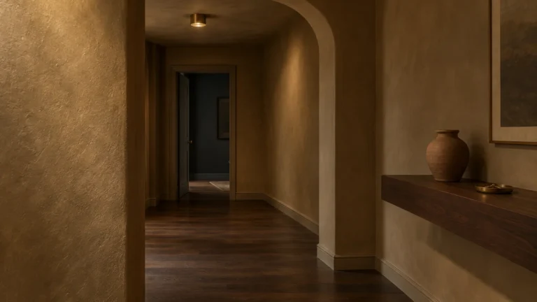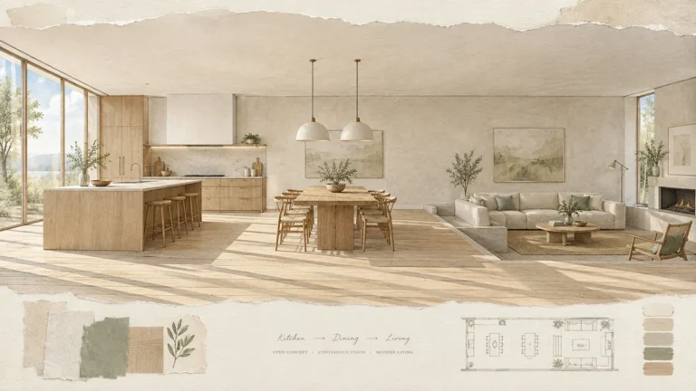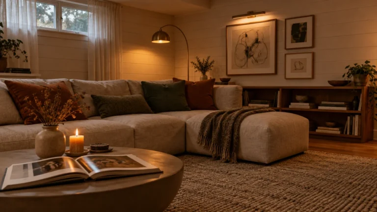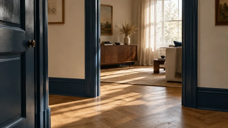
A dedicated home library transforms an underused room into an intentional sanctuary for reading and focus. The right palette sets the mood immediately by balancing natural light, shelving finishes, and cozy textiles.
Selecting the right home library paint colors requires understanding how pigment depth alters your perception of room scale. You can elevate your reading room design with basic tools, thoughtful planning, and confident execution.
This guide highlights twelve proven colors alongside practical painting instructions to help you complete the project. Pick up your brush and learn how to curate a timeless, literary escape.

Project Planning Snapshot
Painting a study requires modest technical skill and careful attention to clean prep work. Any patient homeowner can complete this transformation using standard rollers, angled trim brushes, and quality painter tape.
Expect to spend between one hundred and three hundred dollars for premium paint, drop cloths, and basic tools. Your budget will fluctuate based on room square footage and the number of built-in shelves you tackle.
Plan for a two-day weekend timeline to complete the work without feeling rushed. You will dedicate your first day to washing walls, repairing drywall, and taping edges, leaving the second day for painting.
Working in disciplined phases prevents physical fatigue and allows individual coats to cure properly. Solid preparation protects your flooring and guarantees razor-sharp paint lines along ceiling joints and baseboards.
12 Inspiring Paint Colors for Your Home Library
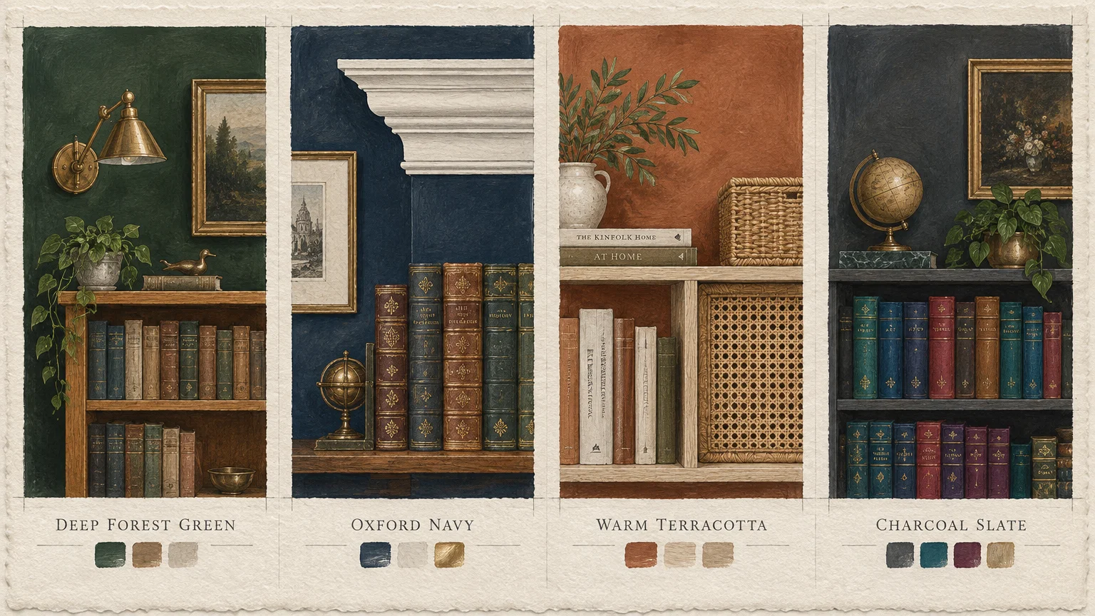
1. Deep Forest Green
Deep forest green introduces an earthy sophistication reminiscent of historic scholarly retreats. This verdant shade absorbs harsh midday glare while highlighting the warm honey tones of antique wood shelves.
Natural sunlight brings out subtle botanical undertones during daytime reading sessions. In evening lamplight, the pigment darkens slightly to wrap the room in quiet focus.
Pair forest green with brass library sconces and rich leather seating for a balanced study. It flatters both modern flat-pack bookcases and traditional architectural crown moulding.
2. Oxford Navy
Oxford navy establishes a disciplined, distinguished backdrop that commands respect without feeling stark. The blue pigment creates an illusion of receding boundaries, which makes modest rooms feel expansive.
You can balance its cool intensity by integrating warm timber finishes like walnut, teak, or cherry. Cream-toned linen curtains and woven wool rugs keep the overall atmosphere welcoming rather than cold.
According to Architectural Digest decor case studies, saturated navy walls flatter gilded book spines and frame white architectural millwork beautifully.
3. Warm Terracotta
Warm terracotta delivers an organic, sun-baked intimacy that immediately relaxes the senses. This reddish-clay hue radiates natural warmth and counters the chill of cold northern daylight.
These cozy library colors create an inviting backdrop for well-loved vintage paperbacks and earthy ceramic accents. The pigment flatters mid-century modern furniture, woven rattan baskets, and pale white oak shelving.
Use an eggshell or velvet sheen with terracotta to prevent unwanted surface shine. Soft ambient light from shaded table lamps enhances its velvety undertones after dusk.
4. Charcoal Slate
Charcoal slate offers a striking, contemporary alternative to classic black study walls. Its deep mineral base feels grounded and modern, turning colorful book collections into focal art pieces.
North-facing spaces will emphasize the cool slate undertones of this assertive shade. Southern exposure, however, warms the gray pigments and creates a velvety, contemplative atmosphere.
Combine charcoal slate with brushed nickel reading lamps and light gray trim to maintain crisp contrast. Bold accents in mustard yellow or rust orange punch through the moody darkness effortlessly.
5. Soft Parchment White
Soft parchment white provides a classic, airy envelope for compact home studies and alcoves. Unlike sterile bright whites, parchment contains subtle amber and beige undertones that soften indoor glare.
The Department of Energy interior lighting and reflectance data explains how lighter paint hues maximize bounce from natural daylight. This high reflectance keeps your reading corner bright without demanding excessive electric lighting.
Frame parchment walls with warm white oak shelves and unbleached cotton upholstery. The resulting palette feels clean, luminous, and effortless throughout all four seasons.
6. Muted Sage
Muted sage introduces a calming, restorative quality that encourages hours of uninterrupted focus. This soft green bridges the gap between traditional library elegance and fresh organic minimalism.
Its gray undertones prevent the color from reading too bright or distracting on large walls. It pairs naturally with botanical prints, unlacquered brass accents, and pale birch bookshelves.
Consider sage if your study doubles as a home office where you spend full working days. The soothing hue reduces visual fatigue while keeping your workspace feeling connected to nature.
7. Rich Burgundy
Rich burgundy evokes the timeless grandeur of centuries-old university reading halls and private clubs. Its decadent red and purple undertones create a luxurious, enveloping atmosphere in any room.
Because red pigments stimulate mental energy, this hue suits spaces reserved for deep study and writing. It pairs magnificently with dark mahogany cases, oriental rugs, and tufted leather armchairs.
Apply two coats of high-grade tinted primer before painting rich burgundy on bare drywall. Deep red bases require consistent grounding to achieve complete opacity across large wall surfaces.
8. Toasted Taupe
Toasted taupe bridges the gap between modern gray and classic beige to create a peaceful sanctuary. This versatile neutral shifts subtly throughout the day, accommodating changing outdoor light with grace.
Evaluating classic study paint colors helps you pinpoint neutrals that let book collections take center stage. Toasted taupe never clashes with assorted spine colors, which keeps visual clutter down.
Layer this warm neutral with textured boucle throws, dark bronze lamps, and matte black hardware. The combination produces a tailored, modern study that feels thoroughly grounded and comfortable.
9. Dusty French Blue
Dusty French blue delivers an air of quiet romance and historic intellectual curiosity. The gray-infused cyan pigment softens direct sunlight and prevents open book pages from blinding you.
This shade complements white shaker cabinetry, gilded vintage frames, and whitewashed floorboards. It creates a dreamlike environment ideal for poetry reading, creative writing, and mindful reflection.
Layer warm cream textiles and walnut side tables to keep the blue palette from feeling sterile. Small doses of brushed gold hardware inject understated luxury into this serene backdrop.
10. Antique Mustard
Antique mustard injects bold warmth and scholastic character into historic and eclectic spaces alike. This historic yellow carries deep ochre undertones, which avoids the nervous energy of primary bright yellows.
The shade glows like candlelight when illuminated by incandescent or warm LED bulbs. It visually enlarges small alcoves and creates a cheerful container for your favorite volumes.
Pair mustard walls with dark walnut desks, matte iron light fixtures, and emerald velvet cushions. The dynamic contrast feels creative, scholarly, and full of vintage personality.
11. Espresso Brown
Espresso brown wraps your reading space in rich comfort, mirroring the deep tones of aged coffee and cacao. This sophisticated dark shade turns tall bookcases and wall surfaces into a cohesive, cocooned retreat.
Design analysis highlighted by HGTV design professionals frequently champions deep brown for small, intimate rooms. It softens room perimeters, which makes boundary corners recede into comfortable shadow.
Complement espresso walls with warm beige armchairs, camel leather ottomans, and polished brass fixtures. The warm highlights break up the dark base and prevent the room from feeling heavy.
12. Smoky Plum
Smoky plum brings an unexpected, dramatic moodiness that feels both scholarly and imaginative. Its nuanced blend of gray, violet, and brown provides rich complexity without overwhelming the senses.
The shade shifts remarkably between daylight and evening, revealing subtle aubergine tones under warm lighting. It makes an artistic statement behind open shelving lined with hardcovers and sculptures.
Style smoky plum with warm brass sconces, bleached maple wood, and dusty rose velvet accents. This balance produces an elevated, bespoke study that stands apart from standard neutrals.

Step-by-Step Execution Framework
Phase 1: Surface Preparation and Room Protection
Empty your bookshelves and move heavy furniture to the center of the room. Drape heavy canvas drop cloths across the flooring to shield your carpets or hardwoods from accidental splatters.
Wash your walls thoroughly using a sponge and a mild solution of warm water and dish soap. Removing household dust, skin oils, and residue ensures the new paint bonds tightly without peeling later.
Inspect the drywall for old nail holes, gouges, or settlement cracks. Fill imperfections with lightweight spackle using a flexible putty knife, feathering the compound flat against the surrounding surface.
Sand the dried spackle with two-hundred-twenty-grit sandpaper until completely smooth to the touch. Wipe down the repaired drywall with a dry microfiber cloth to eliminate all lingering sanding dust.
Review U.S. Environmental Protection Agency indoor air quality guidelines before selecting products for an enclosed reading space. Low-VOC formulations keep indoor air fresh during long reading sessions.
Phase 2: Priming and Detailed Cutting In
Apply quality painter tape along baseboards, door casings, window frames, and ceiling joints. Press the tape edge firmly with a putty knife to prevent wet paint from bleeding underneath.
Apply a dedicated stain-blocking primer across repaired patches and bare drywall spots. When transitioning from pale walls to dark tones like Oxford navy or rich burgundy, use gray-tinted primer instead.
Pour two inches of paint into a handheld trim pail for easy maneuvering. Dip an angled sash brush one-third into the paint and tap off the excess against the rim.
Cut in a two-inch border around ceiling perimeters, corners, electrical outlets, and baseboards. Maintain a wet edge by working in manageable sections, blending brush marks before the liquid begins drying.
Phase 3: Rolling and Uniform Finishing
Fit a nine-inch roller with a three-eighths-inch nap cover for standard smooth drywall. Dampen the roller sleeve slightly with water or a damp rag to prep the synthetic fibers.
Load the roller evenly in a sturdy tray, rolling back and forth along the ribbed ramp. Avoid submerging the roller axle, which causes uneven drips and heavy splatters across the floor.
Work across the wall in four-foot square sections, laying paint down in overlapping W patterns. Roll vertically from ceiling to floor immediately afterward to smooth out ridges and ensure uniform texture.
Wait four to six hours before rolling your mandatory second coat over the entire room. Two thin, uniform coats deliver far greater durability and depth than a single thick, drippy layer.
Peel your painter tape away at a forty-five-degree angle while the second coat feels slightly tacky. Removing tape before the film fully hardens guarantees crisp edges without tearing the fresh paint layer.
Styling and Personalizing Your Reading Room
Creating an inviting reading room requires layering practical textures alongside your chosen wall color. Integrate plush rugs, woven wool blankets, and velvet pillows to soften hard architectural lines and timber surfaces.
Position your primary reading chair near a natural light source to reduce eyestrain during afternoon hours. Add a directional task lamp equipped with warm, twenty-seven-hundred-kelvin LED bulbs for evening reading comfort.
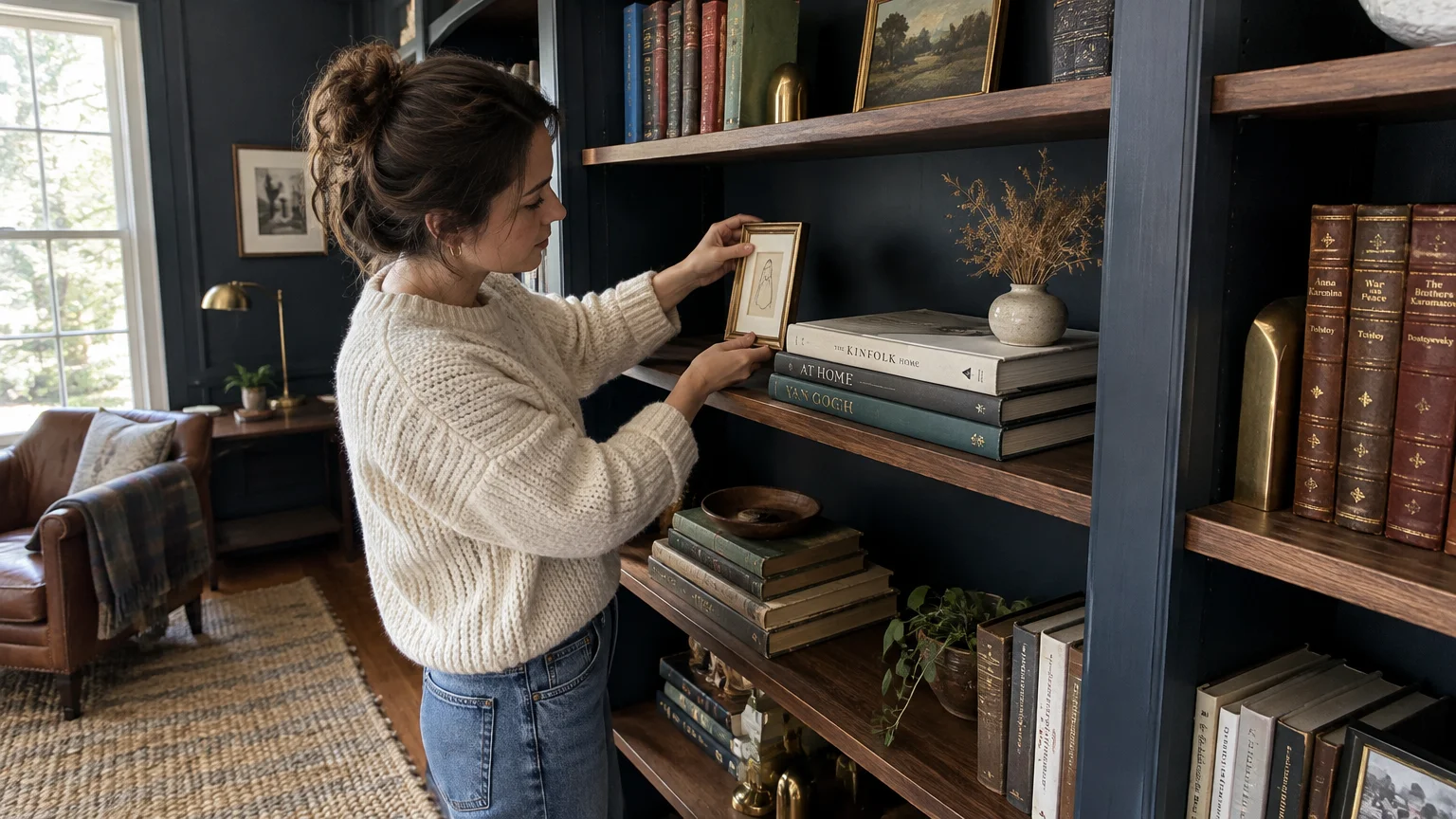
Consider color-drenching your built-in bookcases by coating them in the exact same color as your walls. This sophisticated painting technique dissolves clutter and transforms humble shelving into cohesive, custom architectural millwork.
If you prefer subtle contrast, paint only the back panels of your bookshelves with an accent tone. Dark navy or rich terracotta behind pale volumes creates dramatic dimension without overwhelming the room.
Incorporate small indoor plants like trailing pothos or snake plants to breathe life into book stacks. Greenery punctuates deep moody paint shades and complements neutral hues like soft parchment and toasted taupe.
Display personal treasures, framed family photos, and vintage ceramics between book groupings to tell your story. Rotating these display items periodically keeps your private library feeling curated, fresh, and deeply personal.
Troubleshooting Common Flaws and Long-Term Upkeep
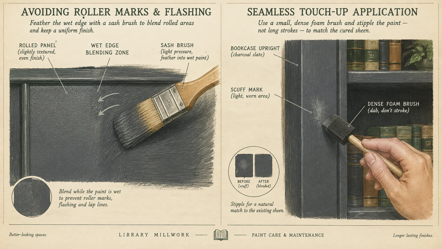
Visible roller lap marks often appear when paint dries too quickly across adjacent wall sections. Prevent this flaw by keeping doors closed, turning off ceiling fans, and maintaining a consistent wet edge.
If you notice paint bubbling or peeling, moisture trapped underneath the surface is usually the primary culprit. Scrape loose blisters flat, sand the edges smooth, apply an oil-based primer, and repaint the area.
Bookshelves often experience scuffs and scratches from heavy hardcover books sliding across horizontal surfaces. Keep a labeled mason jar of leftover paint and a foam brush handy for quick annual touch-ups.
Dust your library walls and shelf ledges twice yearly using an extendable microfiber duster. Removing abrasive airborne dust prevents grime buildup and preserves the original luster of your chosen paint finish.
Clean accidental smudges on eggshell or satin walls with a damp microfiber cloth and mild soap. Never scrub dry paint surfaces with abrasive scouring pads, which burnish the sheen and create shiny spots.
Frequently Asked Questions
Which paint sheen works best for home library walls and built-ins?
Eggshell or matte finishes suit library walls best because they absorb glare from reading lamps and sunlight. However, use satin or semi-gloss enamel on bookshelves and cabinetry to resist abrasion and frequent cleaning.
Satin balances durable washability with a refined, soft glow that handles the friction of heavy book sliding.
How do you choose between dark and light library room colors?
Evaluate your room size and available natural light before committing to a dramatic paint swatch. Dark colors like charcoal or forest green create moody intimacy in spaces used primarily after dark.
Conversely, soft whites and pale sage maximize limited daytime daylight in compact rooms, making them feel open.
Can you paint wooden bookshelves the same color as the walls?
Yes, painting your shelving to match the walls is an effective designer method called color drenching. This approach eliminates visual clutter, unifies mismatched shelving units, and makes small library rooms feel noticeably grander.
Ensure you clean, sand, and apply an adhesion-promoting bonding primer before painting finished wood or laminate surfaces.
What tools do you need to paint behind tight shelving?
Use a four-inch mini roller equipped with a short nap cover to reach tight shelf cavities. A long-handled angled sash brush allows you to cut along interior corner edges with precision and ease.
If your shelves are fixed and extremely narrow, consider painting the back wall before mounting the unit permanently.
Start Building Your Literary Retreat Today
A fresh coat of paint represents the most accessible, high-impact upgrade you can make to your home. Whether you select deep forest green or soft parchment, your new palette will elevate every reading hour.
Do not wait for a full home remodel to give yourself the quiet, inspiring study you deserve. Clear off a small workspace, pick up a few sample pots, and test hues against your shelving today.
With careful preparation and your favorite color on the walls, your dream library is well within reach.