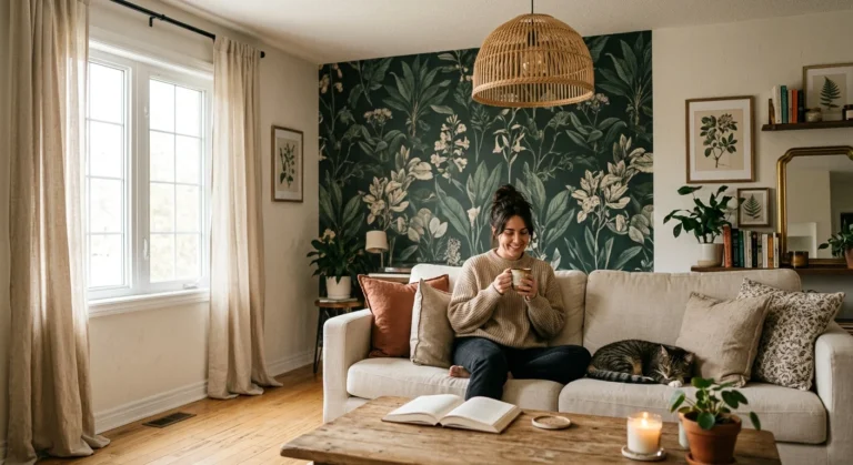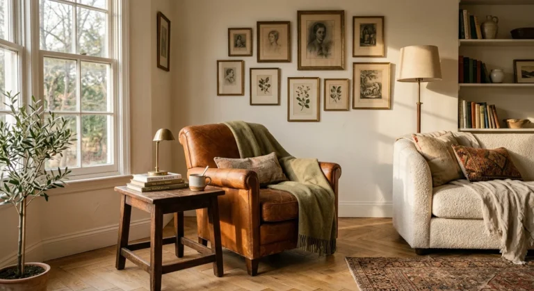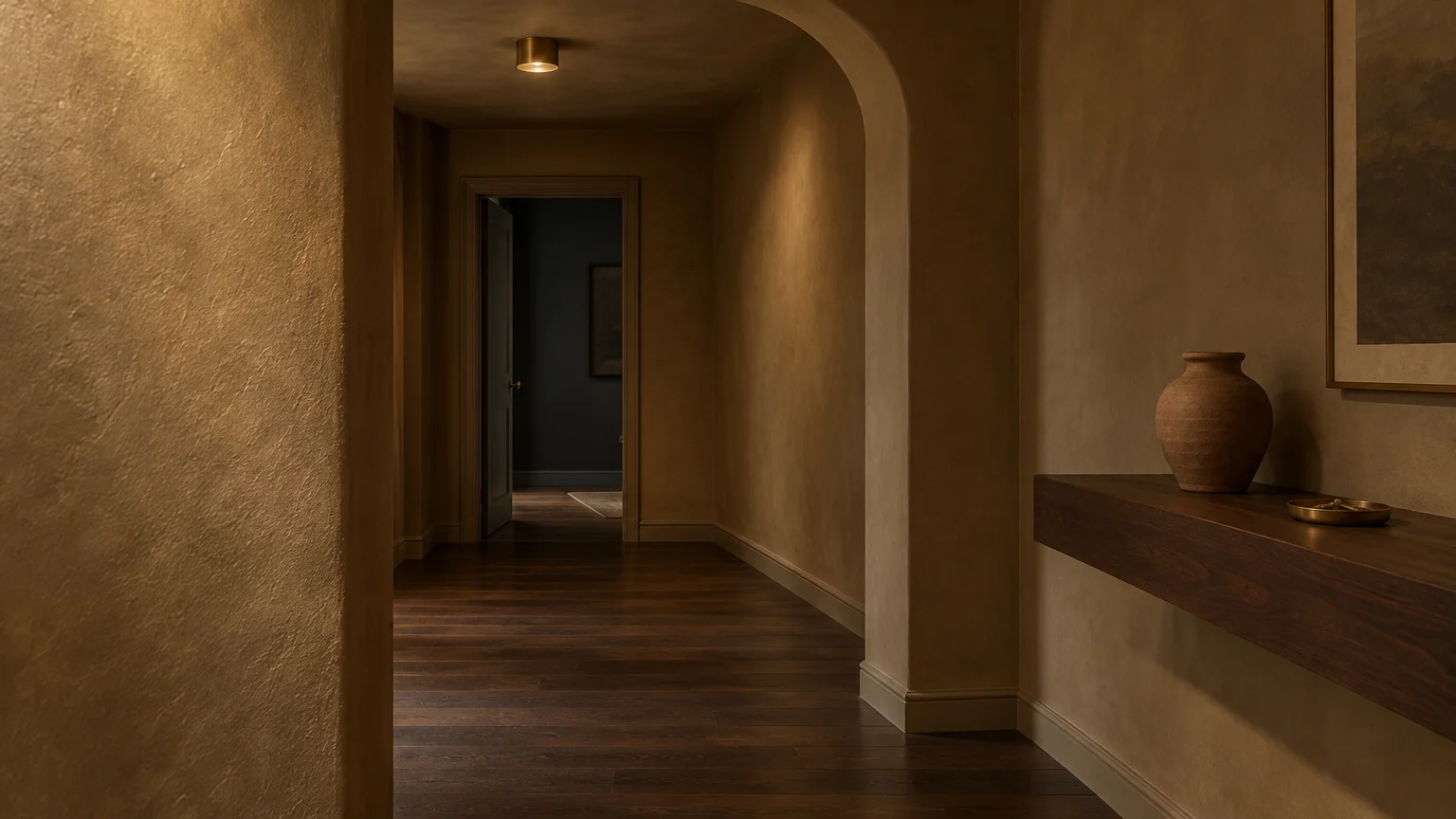
Dark, windowless spaces do not need to feel like cramped, gloomy caves. The right paint formula transforms shadowy rooms into warm retreats by magnifying whatever ambient illumination you possess.
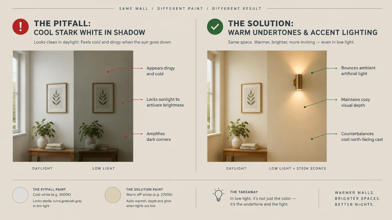
Many homeowners mistakenly assume pure, stark white brightens dark rooms automatically. In truth, cool white turns dingy and chalky without abundant sunlight pouring across your walls.
Selecting paint colors with intentional, warm undertones builds luminous depth where daylight falls short. These eleven proven paint formulas will elevate your dimmest spaces into cozy, vibrant showcases today.
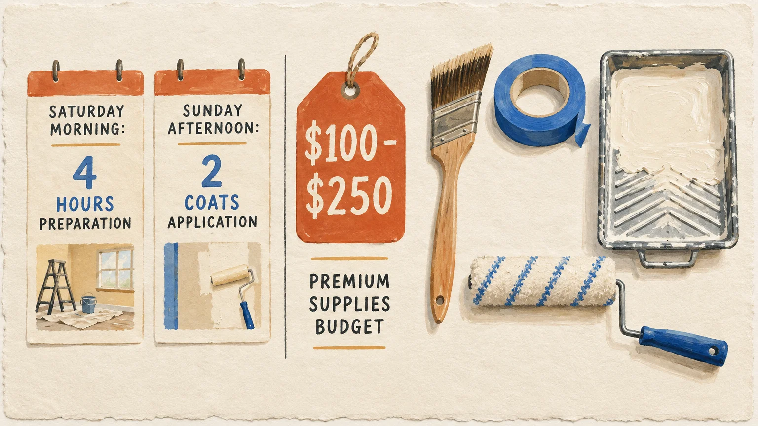
Planning Snapshot for Your Low-Light Painting Project
Budgeting for an interior painting makeover requires minimal cash outlay compared to major renovations. You can typically refresh an average bedroom or windowless den for $100 to $250 in premium supplies.
Set aside one dedicated weekend to complete this transformation smoothly. Dedicate four hours on Saturday morning for preparation, followed by two thorough coats applied across Sunday afternoon.
Beginners can easily tackle this project with fundamental tools and steady patience. As long as you master basic roller mechanics and taping techniques, professional results remain well within your reach.
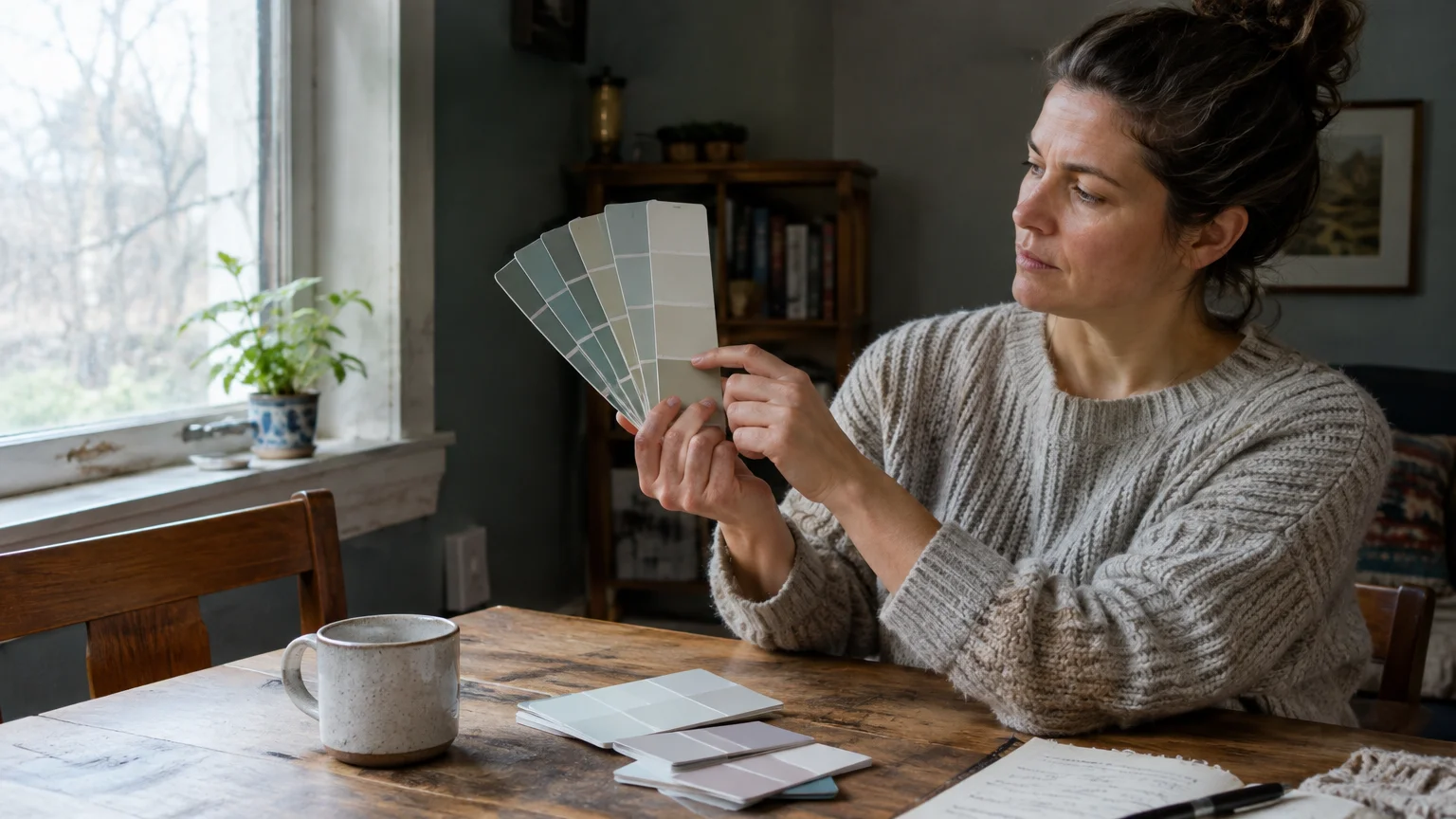
Understanding Light Reflectance Value and Room Orientation
Light Reflectance Value, or LRV, measures the exact percentage of light a color bounces back into the surrounding area. Paint manufacturers rate colors on a scale from 0 to 100, where zero represents absolute black.
North-facing spaces receive cool, bluish light that saps warmth from neutral surfaces. Avoid cool gray or stark white here because they appear flat and uninviting without direct sunlight.
Target warm neutrals with yellow or peach undertones that counterbalance that chilled natural cast. According to color design analysis from Architectural Digest, undertones dictate how a room breathes far more than baseline brightness.
Alternatively, rich and saturated dark pigments create a dramatic jewel-box effect. Deep hues embrace natural shadows rather than fighting them, lending purposeful moodiness to compact spaces.
11 Paint Colors That Excel in Dim Spaces
The following shades balance light reflection, pigment density, and undertone temperature to solve low-light dilemmas. Test physical swatches against multiple walls before making your final selection.
1. Benjamin Moore Swiss Coffee
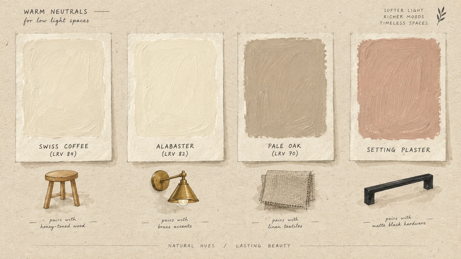
Swiss Coffee offers a creamy, welcoming base with an LRV of roughly 84. Its subtle warmth prevents the sterile look that plagues colder whites under dim artificial bulbs.
Use this shade in north-facing guest bedrooms or shadowed hallways. It pairs cleanly with honey-toned wood accents and soft linen textiles to build an airy, organic atmosphere.
2. Sherwin-Williams Alabaster
Alabaster delivers a soft off-white with an LRV of 82. Gentle beige undertones keep walls bright without veering into yellow territory.
This versatile tone thrives in windowless entryways and narrow staircases. It captures ambient glow from overhead fixtures, making tight quarters feel spacious and exceptionally welcoming.
3. Farrow & Ball Setting Plaster
Setting Plaster mimics the historic charm of freshly applied, unpainted plaster. This dusty pink hue contains earthy yellow pigments that glow warmly under dim conditions.
The shade transforms gloomy powder rooms and shaded reading nooks into sophisticated havens. Pair it with matte black hardware or brushed brass sconces for rich visual contrast.
4. Benjamin Moore Pale Oak
Pale Oak functions as an elegant greige with an LRV around 70. It successfully bridges the gap between soft gray and comforting beige.
This tone neutralizes chilly morning shadows without draining life from your furnishings. Apply it across low-light living rooms where you want modern simplicity paired with coziness.
5. Sherwin-Williams Sea Salt
Sea Salt is an iconic muted green-gray that adapts dynamically to ambient lighting. With an LRV of 63, it introduces fresh, tranquil color without overwhelming dark walls.
In dim rooms, the gray undertones provide necessary grounding while green tones evoke natural foliage. It works wonders in windowless laundry rooms or compact basement bathrooms.
6. Behr Blank Canvas
Blank Canvas features a creamy profile designed to bounce light gracefully. Its balanced undertones simulate the gentle presence of morning sun in enclosed interiors.
Apply this comforting white across windowless home offices to reduce optical strain. It flatters modern oak desks, floating shelves, and woven storage baskets effortlessly.
7. Benjamin Moore Hale Navy
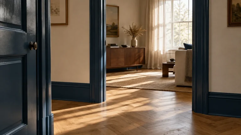
Hale Navy demonstrates the undeniable power of leaning into dark, moody aesthetics. This classic deep blue features an LRV of approximately 8, creating an intimate, velvety environment.
Instead of fruitlessly attempting to brighten a shadowed den, this shade turns darkness into architectural drama. Combine it with warm lamp lighting to produce an undeniably luxurious atmosphere.
8. Sherwin-Williams Accessible Beige
Accessible Beige serves as a fail-safe neutral for homes starved of southern exposure. Unlike dated beige formulas, it incorporates subtle gray undertones that prevent it from reading muddy.
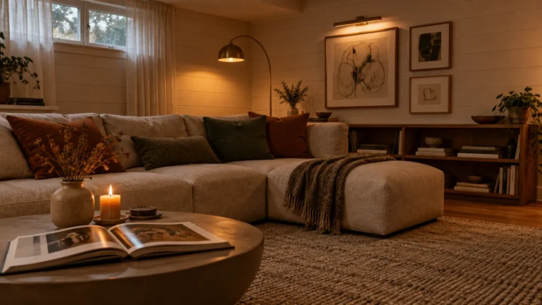
Its medium LRV of 58 provides sufficient depth to stand up against harsh artificial illumination. Coat basement living areas in this shade to establish steady warmth throughout the day.
9. Farrow & Ball Borrowed Light
Borrowed Light evokes the delicate pale blue of an open morning sky. Its soft, atmospheric quality tricks the human eye into perceiving vertical height and open expanse.
Use this delicate blue in cramped bedrooms or narrow dressing areas. It reflects lamplight with a serene luminescence that counteracts oppressive, windowless layouts.
10. Benjamin Moore October Mist
October Mist is an earthy sage hue that creates a tranquil, organic sanctuary. With an LRV of 46, it supplies reliable color depth that does not wash out.
Green sits near the center of the visible spectrum, making it naturally relaxing to human eyes. Paint a sun-deprived nursery or study in this hue to promote calm concentration.
11. Sherwin-Williams Peppercorn
Peppercorn is a sophisticated charcoal gray that contains balanced, neutral undertones. It neither skews cold blue nor warm brown, offering pure, velvety visual richness.
Use Peppercorn in small, dim dining spaces or home theaters to craft intentional luxury. The deep tone makes room perimeters visually recede, giving the illusion of limitless boundaries.
Step-by-Step Application Framework for Dark Spaces
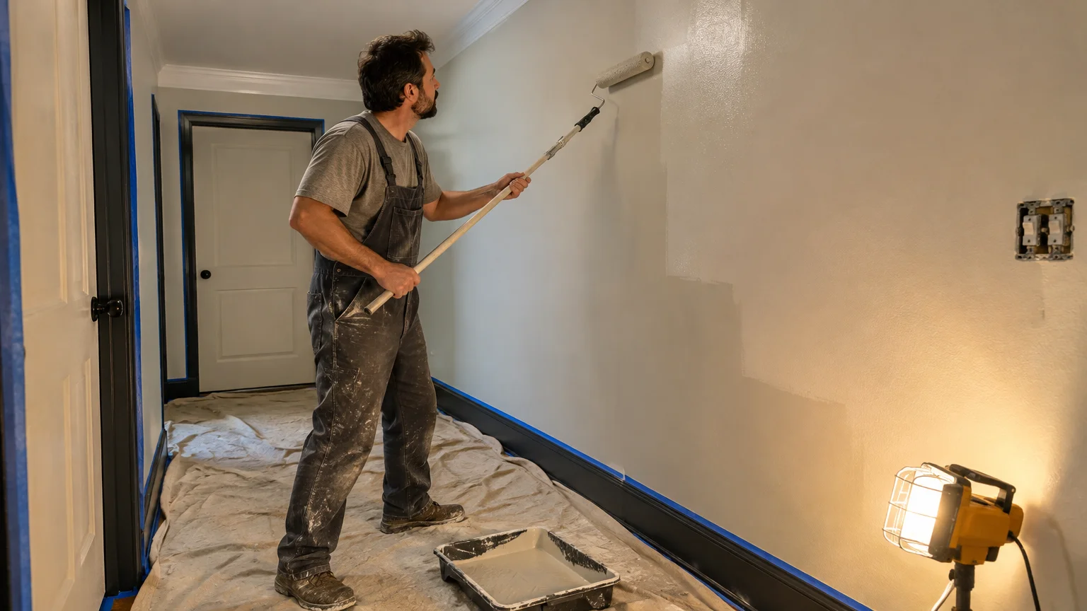
Achieving clean coverage in dim lighting requires structured preparation and methodical execution. Follow these core phases to guarantee seamless results that hold up over time.
Phase 1: Surface Preparation and Inspection
Begin by cleaning your walls thoroughly with a diluted trisodium phosphate or mild soap solution. Grease, dust, and scuffs interfere with paint adhesion, especially in poorly ventilated, dim rooms.
Inspect the surface under strong work lights to identify concealed dents and nail holes. Fill imperfections with lightweight spackle, let it dry, and sand it smooth with fine sandpaper.
Wipe away sanding dust using a damp microfiber cloth before applying painter tape along baseboards. Seal tape edges by running a clean putty knife firmly across the adhesive backing.
Phase 2: Priming and Cutting In
Apply a dedicated high-hiding primer if you are covering dark existing paint or raw drywall patches. Tinting your primer toward the final wall color ensures superior opacity with fewer topcoats.
Use a two-and-a-half-inch angled sash brush to cut in around door casings, baseboards, and ceilings. Maintain a steady hand and work in three-foot sections so your edges stay wet and workable.
Good ventilation protects your health during this stage, so position an oscillating fan near the door. Keeping air moving accelerates drying times and minimizes moisture accumulation in windowless zones.
Phase 3: Rolling and Finishing Coats
Pour paint into a sturdy tray and load a nine-inch roller with a three-eighths-inch nap. Roll paint onto the wall in overlapping W-shaped patterns to distribute coverage evenly.
Smooth out roller stipple by lightly laying off the wet section from top to bottom before moving forward. Never press the roller aggressively against drywall; let the tool do the work.
Allow the first coat to dry for four hours before applying the second coat. Remove tape while the final coat is slightly damp to avoid tearing dry paint films.
Optimizing Sheen and Artificial Lighting
Paint sheen dramatically alters how color behaves when natural sunlight is scarce. Flat finishes absorb light and look dull, whereas high gloss highlights every minor wall defect.
Eggshell or satin finishes deliver the ideal middle ground for low-light environments. As explained in finish guides by HGTV, these sheens offer a delicate luster that bounces ambient illumination cleanly.
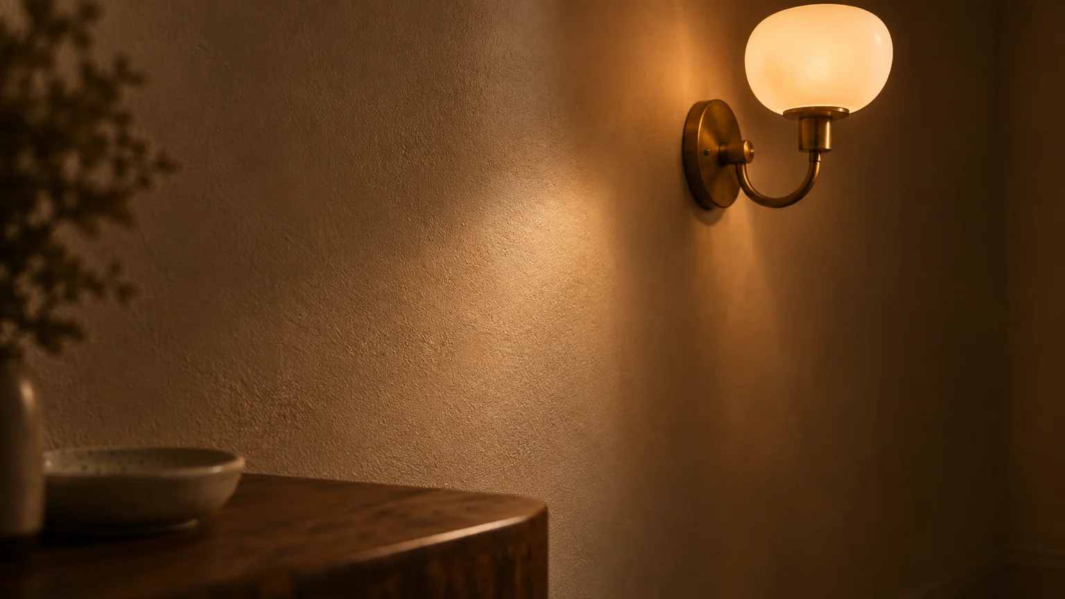
Your choice of artificial bulbs will either flatter or ruin your new wall color. Cold 5000K daylight bulbs cast an unappealing clinical glare across warm neutrals.
The Department of Energy recommends warm white LED bulbs between 2700K and 3000K for living spaces. These warm spectrums mimic late-afternoon sunshine and enhance creamy undertones beautifully.
Layer multiple illumination sources rather than relying on a single overhead fixture. Combine flush mounts with floor lamps and table lamps to banish gloomy shadows across corners.
Troubleshooting Common Low-Light Painting Pitfalls
Uneven sheen or flashing occurs when paint dries unevenly across porous drywall. You can resolve flashing by rolling a uniform second coat with steady roller pressure and overlapping strokes.
Colors sometimes appear muddy or dirty once applied across all four walls. This problem occurs when you choose cool gray undertones that turn dull without southern window exposure.
If your neutral appears dingy, shift your light bulbs to a higher color rendering index rating. Specialists at Colorado State University Extension highlight that high CRI bulbs reveal true color vibrancy indoors.
Neglecting the ceiling represents another frequent design error in light-deprived spaces. Coat your ceiling in a clean, reflective flat white to bounce ambient lamplight downward across the entire room.
Frequently Asked Questions
Should you paint ceilings bright white in a low-light room?
Yes, a bright flat white ceiling reflects lamplight down into living zones effectively. Using pure white overhead prevents shadowed ceilings from visually pressing down into compact spaces.
However, if you choose deep moody colors for your walls, painting ceilings the same hue creates cozy drama. Test your preference using swatches placed against the ceiling boundary first.
What paint finish or sheen works best for dim hallways?
Satin works exceptionally well in high-traffic, dim hallways. It reflects ambient glow from adjacent rooms while resisting frequent handprints, scuffs, and cleaning abrasions.
Eggshell provides a slightly softer alternative if your hallway walls possess noticeable texture or drywall repairs. Both choices outperform flat coatings in low-light corridors.
How many sample swatches should you test before committing?
You should test at least three distinct shades before purchasing complete gallons. Paint generous twelve-inch sample squares on poster board rather than applying paint directly to drywall.
Move your sample boards around the room throughout the day and observe them under artificial lamps. This practical test reveals subtle undertone shifts before you invest serious time and money.
Can dark paint colors actually make a small, dim room feel bigger?
Deep colors blur room boundaries because your eyes cannot easily perceive where corners meet. By masking spatial edges, rich shades like charcoal or navy create a boundless, atmospheric effect.
This design strategy turns an awkward, windowless room into an intentional, jewel-box sanctuary. Pair deep tones with mirrors and reflective metallic fixtures to amplify available light.
Bring New Life to Your Dim Space Today
A lack of natural light should never limit your interior design ambitions or everyday comfort. By pairing the right undertones with thoughtful lighting, you can transform the dimmest corner into a stunning retreat.
Pick up your favorite sample pots this weekend and test them against your shadowed walls. A fresh coat of paint remains the fastest, most affordable way to fall in love with your home again.