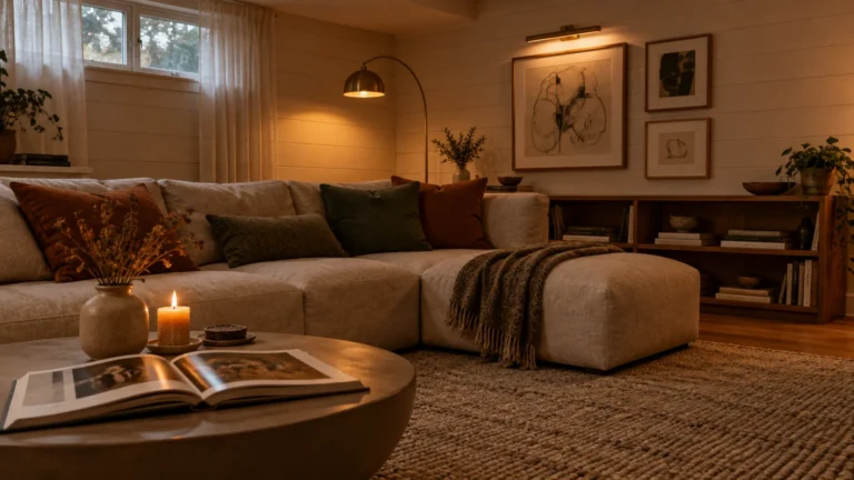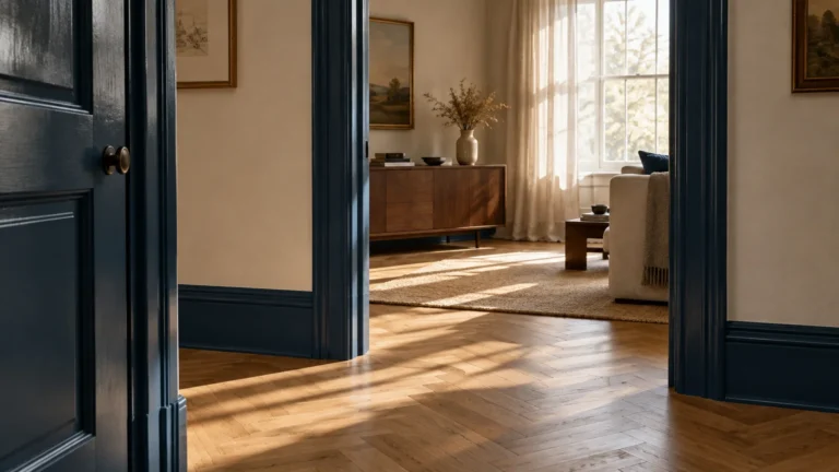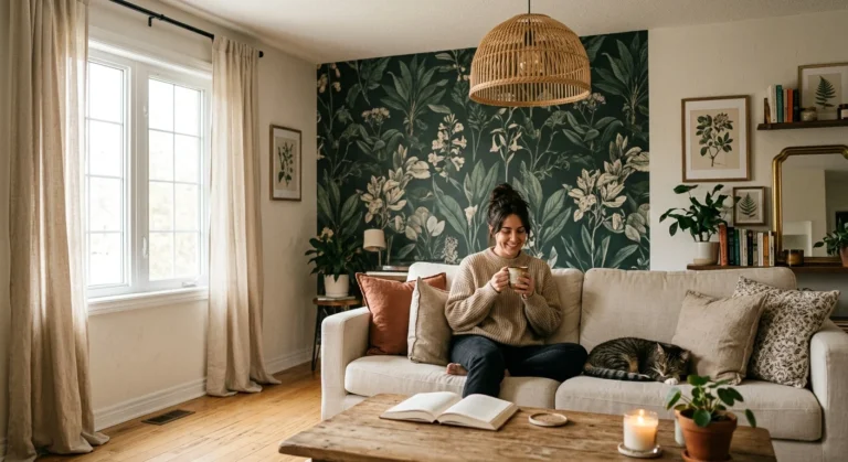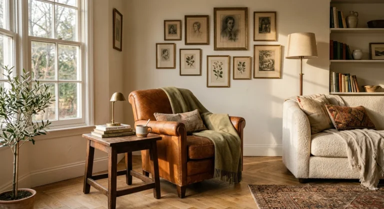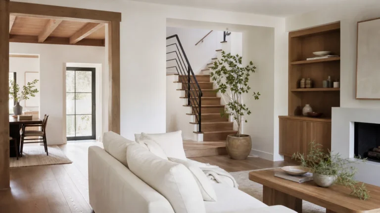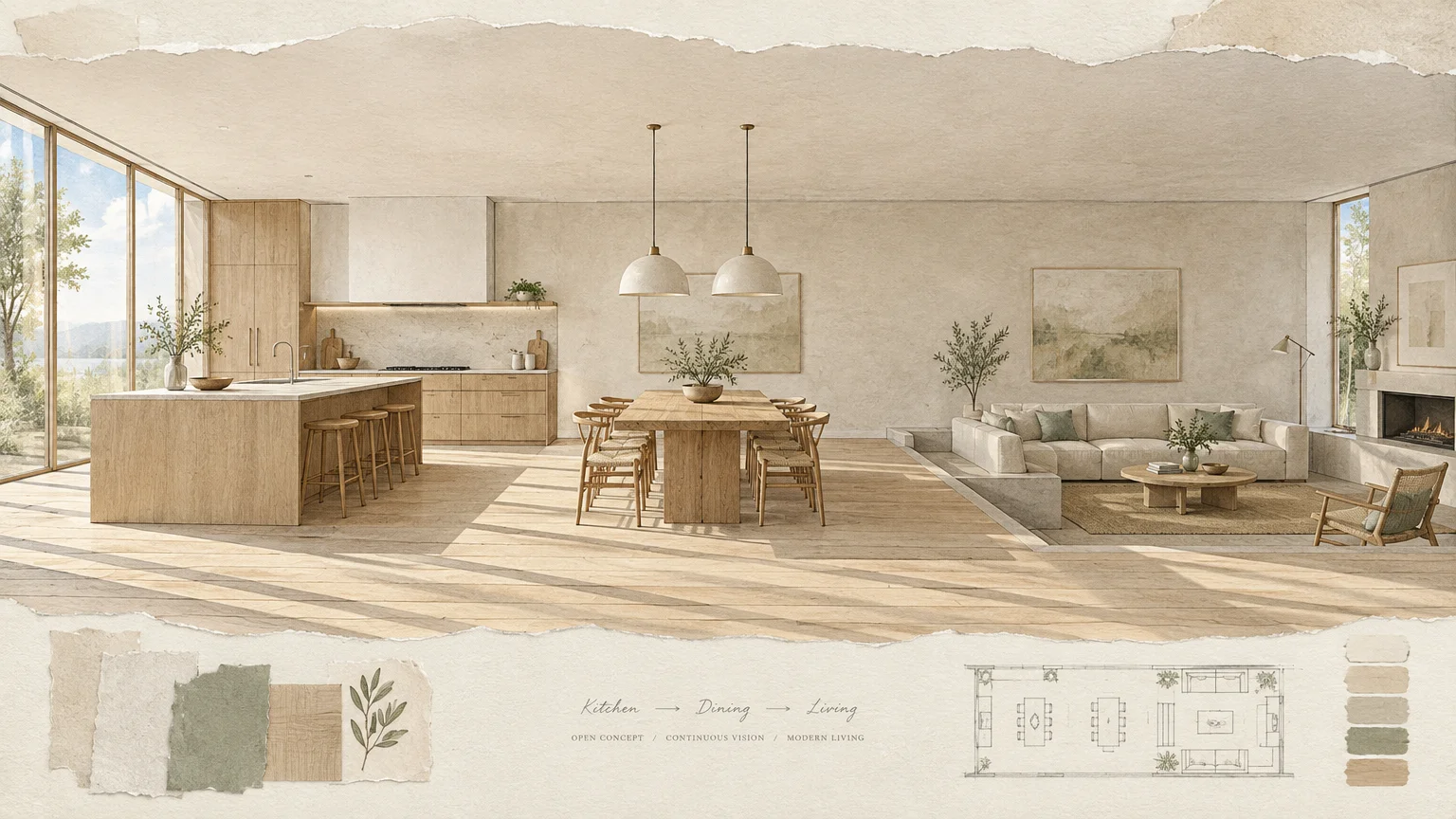
Choosing the right palette turns an echoing open floor plan into a harmonious, connected retreat. A unified color strategy eliminates jarring boundaries while giving distinct functional zones their own personality.
You can bridge the visual gap between your kitchen, dining room, and living area with a single cohesive paint strategy. The right undertones guide the eye naturally across expansive drywall expanses.
This curated guide highlights twelve proven designer shades engineered to maintain seamless flow across broad sightlines. Grab your roller and discover how subtle tonal shifts maximize spatial harmony throughout your home.
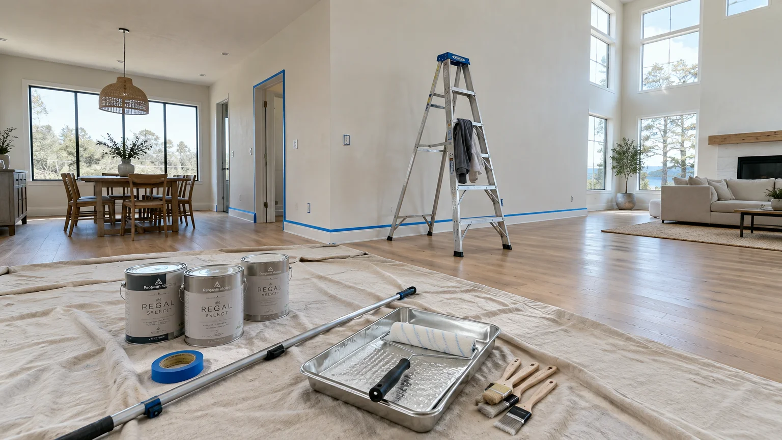
Planning Snapshot for Your Open Concept Paint Project
Executing a whole-house paint transformation requires realistic planning before opening the first can. Most open floor plans span between 800 and 1,500 square feet of continuous wall space.
Expect to budget between $300 and $600 for premium paints, primers, rollers, and professional painter tape. Investing in high-grade acrylic latex formulas pays dividends in coverage, scrubbability, and longevity.
A project of this scale generally demands two full weekends of focused effort. Dedicate your first weekend entirely to surface repairs, thorough cleaning, and edge taping.
Reserve your second weekend for rolling primer and two topcoats across adjoining walls. Working methodically prevents physical burnout and guarantees crisp, professional transitions.
This project rates at an intermediate DIY skill level. Managing long sightlines and ceiling cut lines requires steady balance, reliable ladders, and patient technique.
The Science of Flow: Sightlines, Undertones, and Reflectance
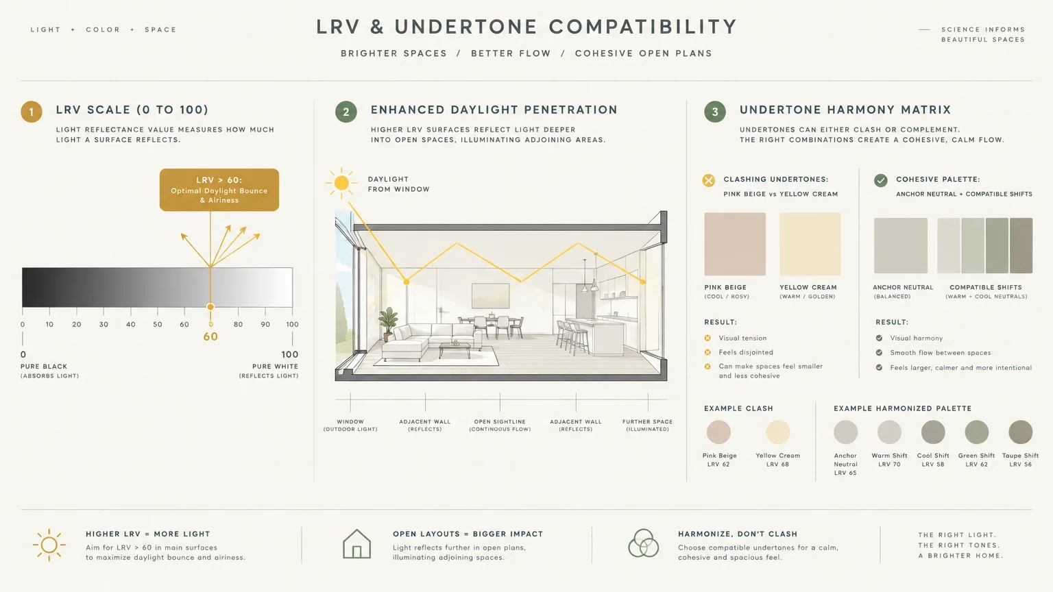
Open layouts lack architectural dividers, meaning your eye perceives multiple living zones simultaneously. Visual friction occurs when adjacent walls feature conflicting undertones, such as pink beige clashing against yellow cream.
To achieve seamless transitions, evaluate the Light Reflectance Value, or LRV, of every prospective color. Designers at Architectural Digest design features recommend choosing shades with compatible LRV ratings to balance daylight.
LRV measures the percentage of light a paint color reflects on a scale from zero to one hundred. Colors with an LRV above sixty keep cavernous great rooms airy and luminous.
According to Department of Energy lighting guidance, lighter interior wall colors also enhance daylight penetration. This reflective quality brightens dim corners and reduces your reliance on artificial illumination during daytime hours.
To unify shared spaces, select a single anchor neutral that carries through your primary traffic areas. You can then introduce subtle hue variations within recessed alcoves or breakfast nooks.
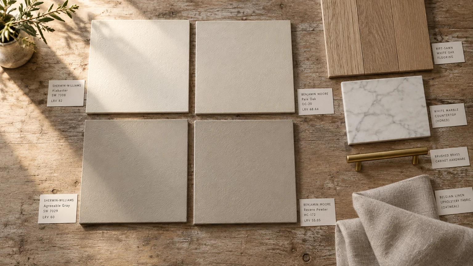
12 Designer-Approved Paint Colors That Make Open Layouts Flow
1. Sherwin-Williams Alabaster (SW 7008)
Sherwin-Williams Alabaster features a balanced LRV of 82 that supplies warm illumination without reading creamy or yellow. This versatile shade softens the contrast between dark kitchen cabinetry and neutral living room upholstery.
2. Benjamin Moore Pale Oak (OC-20)
Benjamin Moore Pale Oak bridges the gap between crisp off-white and delicate taupe with an LRV of 68.64. Its chameleon undertones adapt gracefully to shifting light conditions between northern and southern exposures.
3. Sherwin-Williams Agreeable Gray (SW 7029)
Agreeable Gray reigns as a premier choice among whole house paint colors because of its balanced LRV of 60. By blending warm beige with cool gray, it harmonizes diverse flooring materials across adjoining spaces.
4. Benjamin Moore Revere Pewter (HC-172)
Revere Pewter remains an enduring favorite for large spaces, holding an LRV of 55.05. Its earthy undertones supply substantial color presence that grounds open dining and living combinations without feeling heavy.
5. Farrow & Ball School House White (No. 291)
School House White delivers an understated off-white formulated without cool undertones for a timeless aesthetic. Its chalky, matte quality softens intense window glare across long open corridors and shared dining rooms.
6. Sherwin-Williams Sea Salt (SW 6204)
Consulting authoritative HGTV color resources highlights Sea Salt as a top choice for relaxed transitions. Carrying an LRV of 63, this muted gray-green connects kitchen workspaces to airy family rooms.
7. Benjamin Moore White Dove (OC-17)
Benjamin Moore White Dove boasts an LRV of 83.16, creating luminous walls that never feel sterile. Applying this shade continuously across shared walls and ceiling planes establishes unmatched spatial continuity.
8. Sherwin-Williams Repose Gray (SW 7015)
Repose Gray provides a crisp aesthetic with an LRV of 58 and subtle undertones of cool violet. This modern neutral complements stainless steel appliances and prevents open kitchen concepts from looking dated.
9. Benjamin Moore Classic Gray (OC-23)
Classic Gray offers an ultra-pale neutral with an airy LRV of 73.67 for homes needing subtle contrast. It brightens deep interior rooms that rely on distant perimeter windows for their natural daylight.
10. Sherwin-Williams Accessible Beige (SW 7036)
Accessible Beige eliminates dingy yellow casts while delivering cozy warmth with an LRV of 58. It pairs exceptionally well with honey-toned hardwood floors, stone fireplaces, and rich leather furnishings.
11. Benjamin Moore Hale Navy (HC-154)
Benjamin Moore Hale Navy features an LRV of 8.36 and demonstrates how saturated tones anchor open spaces. Use this deep classic navy on kitchen islands or media accent walls to create intentional visual focus.
12. Farrow & Ball French Gray (No. 18)
French Gray acts as an organic bridge between green and gray that shifts throughout the day. It defines shared entryways, breakfast nooks, and mudrooms while preserving a gentle visual flow.
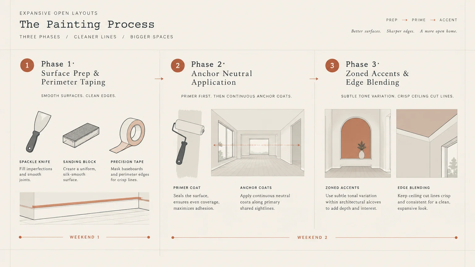
The Three-Phase Painting Framework for Flawless Transitions
Phase 1: Surface Preparation and Masking
Thorough preparation determines ninety percent of your final paint finish quality. Clear furniture away from walls and protect your entire floor area using heavy canvas drop cloths.
Patch drywall dings and seam cracks with lightweight spackling compound, then sand surfaces flush with 120-grit sandpaper. Wipe down every wall using a damp microfiber cloth to remove residual sanding dust.
Review Environmental Protection Agency indoor air quality standards and choose low-VOC primers and paints. Apply painter tape firmly along baseboards using a flexible putty knife to seal edges against seepage.
Phase 2: Systematic Application and Cutting In
Work across your open space in manageable sections to keep a wet edge throughout application. Use a two-and-a-half-inch angled sash brush to establish crisp, clean margins along ceilings and trim lines.
Cut in only as far as you can roll within twenty minutes to avoid noticeable brush halos. Blending wet brushed borders into wet rolled wall fields creates a unified, streak-free surface.
Load your nine-inch microfiber roller evenly and apply paint in overlapping W-shaped patterns across four-foot sections. Finish each section with gentle downward vertical passes to level the paint film consistently.
Phase 3: Curing, Inspection, and Clean Finishing
Allow your first coat to dry for at least four hours before rolling your second application. Rushing recoat drying times traps moisture beneath the surface, resulting in uneven sheen or blistering.
Inspect walls under angled task lighting to confirm full coverage across all major sightlines. Remove painter tape at a sharp forty-five-degree angle while the final coat remains slightly damp to the touch.
Allow your newly painted walls to cure undisturbed for thirty days before washing or scrubbing surfaces. Full curing hardens the acrylic resin matrix against household scuffs and everyday friction.
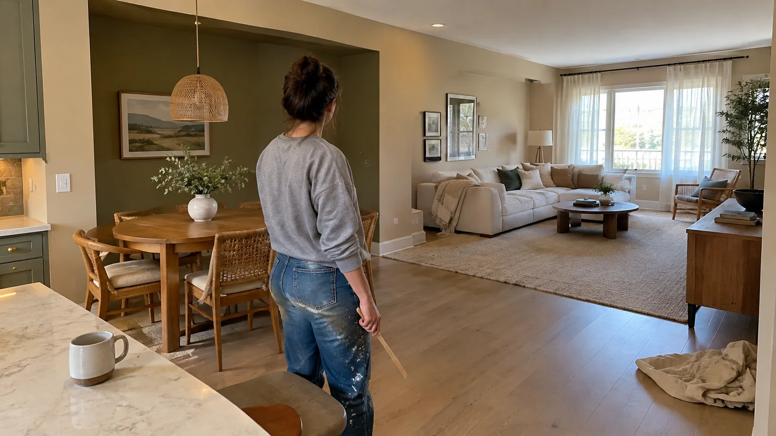
Styling and Personalizing Your Open Floor Plan
Maintaining continuous paint flow does not mean your living areas must appear repetitive or monotonous. You can personalize functional zones by layering contrasting textures, textiles, and purposeful accent decor.
Define specific seating or dining areas with large woven area rugs that anchor your furniture arrangements. A plush rug establishes dedicated room boundaries without building physical partition walls.
Incorporate varied materials like natural oak, textured linen, and matte black hardware across each zone. These physical textures introduce rich visual depth against your unified wall color.
Maintain lighting temperature consistency across connected fixtures to safeguard your open concept color scheme. Keep light bulbs within a warm 2700K to 3000K range to prevent discolored wall patches.
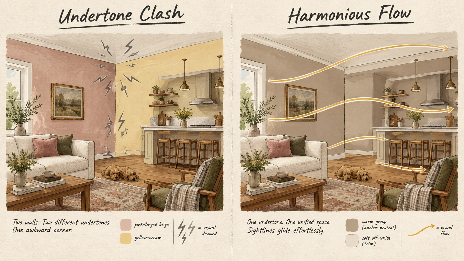
Troubleshooting Common Open Layout Paint Mistakes
A frequent mistake in open layouts is attempting color changes across outer drywall corners. Outer corner color transitions disrupt sightlines and create an awkward, unfinished appearance.
Always transition paint colors at inside corners or natural structural breaks like archways and built-in cabinetry. This structural alignment hides the paint line and maintains an intentional aesthetic.
Never commit to gallons before evaluating large color swatches directly inside your specific living environment. Natural light shifts dramatically between sunny kitchen windows and shadowed interior corridors.
Paint two-foot sample swatches onto movable poster boards rather than applying samples onto existing walls. Move these boards into different zones throughout the day to evaluate undertones under changing daylight.
Frequently Asked Questions
What paint sheen works best for open floor plans?
Eggshell or satin sheens offer the ideal balance of durability and low glare for high-traffic layouts. They diffuse light smoothly across wide drywall expanses while providing scrubbability around kitchen workspaces.
Flat sheens conceal drywall imperfections but resist scrubbing poorly in dining and cooking areas. High-gloss finishes reflect excessive glare, making vast walls appear wavy under strong overhead light.
Should ceilings in an open layout be painted the same color as the walls?
Painting ceilings a crisp flat white reflects daylight and lifts lower ceiling planes visually. In contrast, painting ceilings to match walls wraps expansive spaces in a cozy, contemporary ambiance.
If your ceilings measure under nine feet, stick with clean ceiling white to maximize vertical headroom. For vaulted or double-height great rooms, matching wall colors softens towering proportions.
How do I choose an accent wall in an open concept home?
Locate accent walls on architectural focal points, such as fireplace surrounds or recessed dining alcoves. Avoid choosing arbitrary drywall expanses that carry over into adjoining functional zones.
Ensure your accent color shares complementary undertones with your primary best neutral paint colors. Coordinated undertones prevent your statement wall from clashing with surrounding living areas.
How many total paint colors should I use in an open floor plan?
Limit your core open floor plan paint colors palette to three or four coordinating shades. Select one dominant anchor color, one trim white, and one or two subtle secondary accents.
Restricting your palette prevents visual clutter and maintains seamless flow across your entire living space. You can easily add vibrant personality through artwork, accent rugs, and decorative pillows.
Bring Your Open Layout Vision to Life
Transforming your open concept living space begins with thoughtful color selection and confident execution. A unified palette creates an inviting, balanced environment where your household can thrive.
Select your favorite sample swatches, test them against your daylight, and start your prep work. With the right paint colors that flow across your walls, your dream home is well within reach.