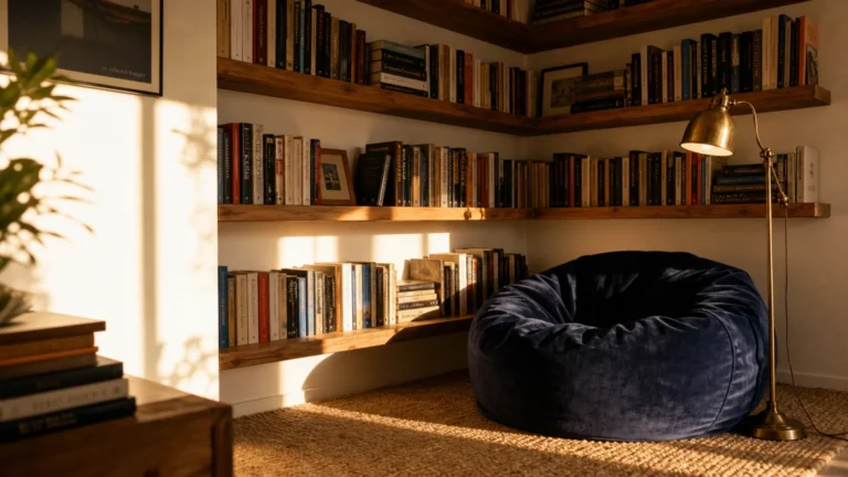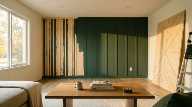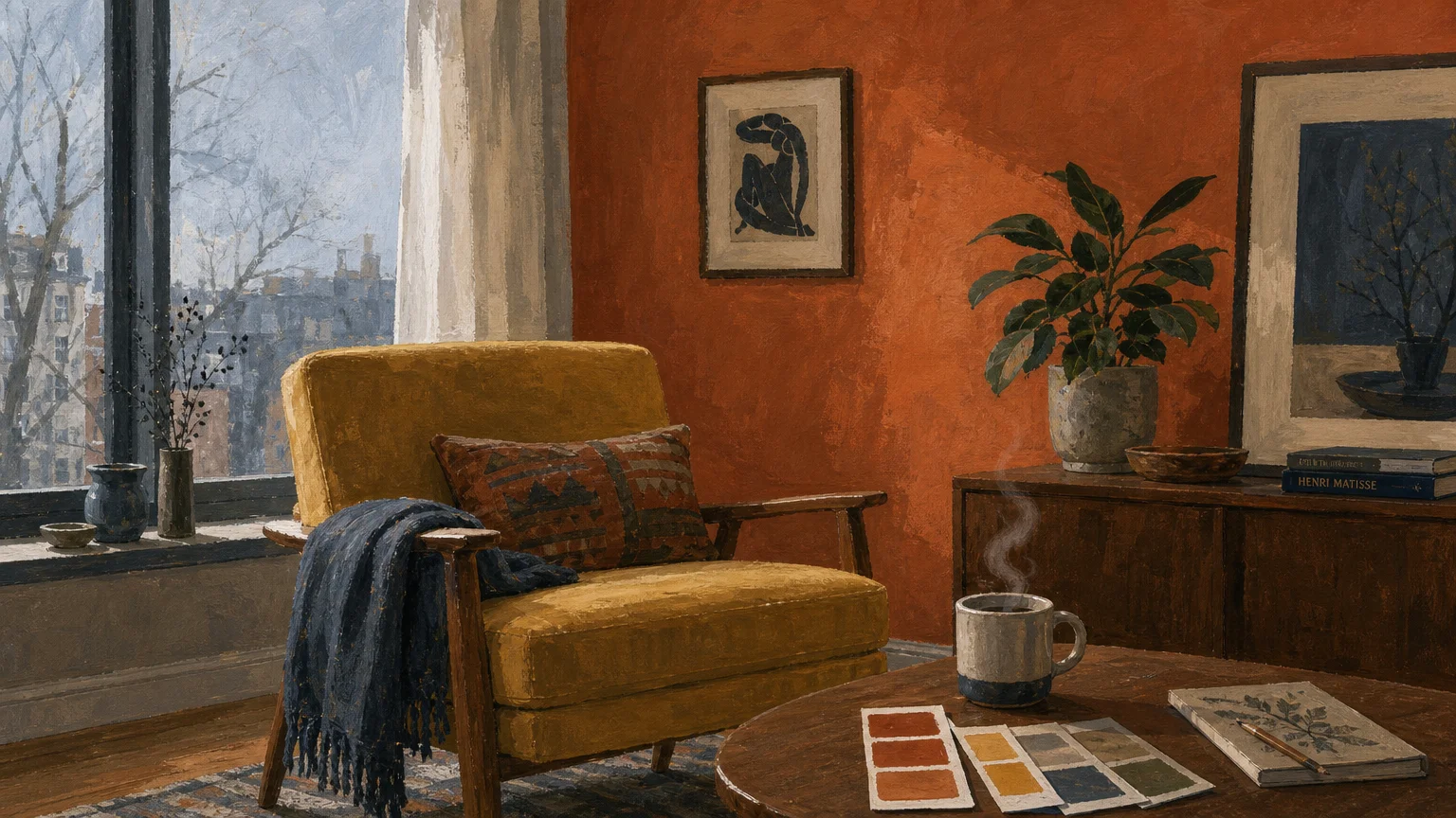
Reviving a dreary, shadow-filled space begins with mastering the unique light dynamics of north-facing rooms. You can instantly transform a cold, dim layout into a vibrant retreat by choosing paint colors with the right undertones. North-facing windows pull in cool, indirect sunlight that washes out standard neutrals and turns crisp whites into dismal grays. Instead of fighting the lack of natural warmth, you must select specific hues that actively counteract the chill or lean into the moody atmosphere. Navigating this lighting challenge requires moving beyond standard color swatches and exploring unexpected shades that thrive in low-light environments.
Assessing Your Painting Project Parameters
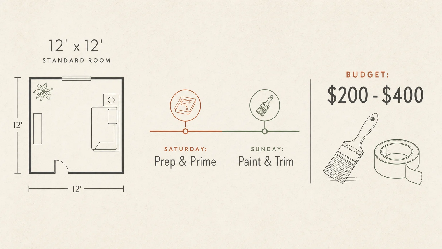
Breathing life into a dimly lit room requires realistic planning before you pry open a single paint can. You can easily tackle a standard twelve-by-twelve foot bedroom or home office over a single weekend. Dedicate your Saturday to meticulous preparation and initial priming, reserving Sunday for applying the color coats and handling the finishing touches. Budgeting for this transformation remains highly approachable; you should expect to spend between two hundred and four hundred dollars for the entire space. This estimate accounts for premium, high-hide interior paint, high-quality angled brushes, painter’s tape, and surface preparation materials.
Your skill level dictates your confidence, but painting heavily relies on patience rather than advanced technical expertise. Beginners can achieve professional-grade results by refusing to rush the preparation phase and investing in premium applicators. Cheap rollers leave behind lint and uneven textures, while bargain brushes shed bristles directly into your freshly painted trim. Spending an extra twenty dollars on top-tier tools saves you hours of frustration and ensures your unexpected color choice applies smoothly. Understanding the full scope of your material needs involves calculating exact paint quantities before heading to the hardware store, ensuring you maintain a wet edge throughout the project without running out of product mid-wall.

Mastering the Painting Process
Phase One: Preparation and Priming
Flawless walls start with obsessive preparation. Begin by clearing all furniture from the perimeter of the room and laying down thick, canvas drop cloths. Canvas absorbs accidental splatters immediately; relying on cheap plastic sheeting creates a slippery surface where wet paint tracks onto your shoes and subsequently throughout your home. Wash the walls with a damp sponge and a mild degreasing solution to strip away airborne dust and natural oils. You must meticulously inspect the drywall for nail holes, dents, or scratches. Fill every imperfection with a lightweight spackling compound using a flexible putty knife, and sand the patches perfectly flush with 120-grit sandpaper once dry.
Applying painter’s tape requires a steady hand and strict attention to detail. Press the edges of the tape down firmly along your baseboards, window casings, and ceiling lines using a five-in-one tool or a stiff plastic card to prevent bleeding. Because north-facing rooms inherently lack light, you should strongly consider applying a tinted primer before your main color. Primer seals the porous drywall patches and creates a uniform surface for the new paint to grip. Using a high-quality primer ensures your final color develops its true depth and richness without requiring four exhausting coats of expensive topcoat.
Phase Two: Applying Your Chosen Hue
Execution requires a systematic approach to maintain an even, professional finish. Start by “cutting in”—using a high-quality, two-and-a-half-inch angled sash brush to paint a three-inch border around all trim, corners, and ceiling lines. You must maintain a wet edge to prevent lap marks, meaning you should only cut in one wall at a time before moving directly to rolling the main surface. Pour your carefully selected paint into a sturdy plastic tray and load a three-eighths-inch nap roller evenly. Avoid submerging the roller entirely; instead, roll it into the shallow end of the tray until the cover absorbs the paint without dripping.
Apply the paint to the wall using a continuous, overlapping W-pattern. Roll from the ceiling downward, distributing the paint evenly across a three-foot section before moving horizontally. You must work briskly but carefully, ensuring you spread the paint without applying excessive pressure to the roller handle. Pressing too hard creates distinct ridges of paint at the edges of the roller, which dry into permanent, unsightly lines. Allow the first coat to dry completely according to the manufacturer’s instructions—usually around four hours—before evaluating the coverage and applying the mandatory second coat for maximum color saturation.
Phase Three: Finishing Touches and Cleanup
The final phase demands precise timing to achieve crisp, professional lines. You must remove the painter’s tape while the final coat of paint remains slightly damp to the touch. Waiting until the paint cures completely allows the acrylic film to bridge the gap between the wall and the tape; pulling it then will rip jagged chunks of your new color right off the drywall. Carefully pull the tape back on itself at a sharp forty-five-degree angle to slice through the wet paint film cleanly. Once you remove the tape, allow the walls to cure entirely before moving furniture back into position or rehanging heavy artwork.
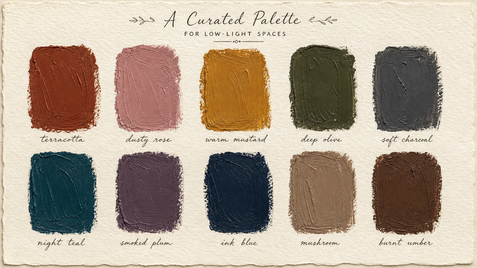
10 Unexpected Paint Colors for North-Facing Rooms
1. Saturated Mustard Yellow
Many homeowners fear yellow, assuming it will look overly aggressive or juvenile. However, in a north-facing room, a deeply saturated mustard yellow provides necessary visual warmth without relying on direct sunlight. The cool, bluish light from the north balances the intensity of the mustard, resulting in a rich, enveloping glow rather than an overwhelming neon glare. You can pair this bold hue with dark wood furniture and brass accents to create a sophisticated, energized environment that mimics the feeling of a sunlit afternoon, even on overcast days.
2. Earthy Terracotta
When you want to inject genuine coziness into a chilly room, terracotta serves as the ultimate remedy. This baked clay color carries heavy orange and red undertones that actively fight back against the icy light entering your windows. While standard beige turns flat and lifeless in northern exposure, terracotta retains its dynamic, grounding energy. Using this shade wraps the room in a comforting embrace. It works exceptionally well in dining rooms or intimate seating areas where you want to encourage conversation and lingering warmth.
3. Deep Aubergine
Instead of trying to force a dark room to look light, you can lean into the shadows by embracing darker, moody atmospheres. Aubergine—a complex, brownish-purple—excels in north-facing spaces. Because it relies on depth rather than high reflectance, aubergine turns a dimly lit room into a dramatic, jewel-box sanctuary. The cool northern light highlights the purple notes, while the dark base color absorbs shadows seamlessly. You achieve an elegant, cave-like retreat perfect for a primary bedroom or a dedicated media room.
4. Muddy Blush
If you prefer a lighter palette but struggle with cold whites, a muddy blush offers a spectacular alternative. Avoid bubblegum pinks; you need a sophisticated blush grounded heavily with brown or gray undertones. The subtle red base in the blush gently warms the incoming cool light, casting a flattering, soft-focus glow across the room. This color thrives in bathrooms and bedrooms, providing enough lightness to make the room feel spacious while actively counteracting the graying effect of northern exposure.
5. Mushroom Greige
Finding a neutral that does not look like wet cement in a north-facing room poses a significant challenge. Mushroom greige succeeds where traditional gray fails because it features a strong taupe and brown foundation. This earthy undertone prevents the color from flashing blue or purple when the indirect light hits it. You gain a versatile, highly adaptable backdrop that feels incredibly soft and natural. Mushroom pairs beautifully with heavy textures like linen, wool, and natural stone, making it a stellar choice for organic modern living spaces.
6. Rich Chocolate Brown
Chocolate brown represents the ultimate in unexpected comfort for shadowy rooms. Much like aubergine, this deep shade stops fighting the lack of light and instead capitalizes on the room’s inherent coziness. A high-quality chocolate brown paint creates a velvety, immersive experience. When you apply this color to both the walls and the trim, you blur the boundaries of the room, making the space feel expansive and intimate simultaneously. It provides a striking backdrop for vintage rugs, leather upholstery, and vibrant green houseplants.
7. Saturated Teal
Teal bridges the gap between warm and cool tones, making it an architectural powerhouse in tricky lighting. The blue aspect connects naturally with the cool northern light, while the green undertone injects organic warmth and vitality. You should opt for a heavily saturated teal rather than a pale pastel; pastels tend to wash out and look institutional in low light. A bold, medium-to-dark teal infuses the space with energy and sophistication, working flawlessly behind open shelving or as a grounding force in a home library.
8. Warm Olive Green
Bringing the outdoors inside helps mitigate the sterile feeling of a sunless room. Olive green carries a significant amount of yellow in its base, which provides the necessary warmth to survive northern light. This shade feels inherently relaxing and restorative. You can utilize olive green in home offices or guest bedrooms to create a focused, tranquil environment. The color adapts beautifully as the sun shifts from morning to evening, deepening into a rich, forest-like hue as dusk approaches.
9. Soft Lavender
Sometimes the best approach involves playing harmoniously with the cool light rather than trying to overpower it. A soft, gray-based lavender accepts the bluish tint of northern daylight and transforms it into a deliberate design choice. The trick involves ensuring the lavender possesses enough gray to avoid looking like a nursery. When executed correctly, this unexpected hue feels incredibly chic and Parisian. You can elevate the lavender further by incorporating highly reflective surfaces like oversized mirrors and polished chrome hardware to bounce the ambient light efficiently.
10. Buttercream Off-White
If you absolutely must have white walls, stark, brilliant whites will inevitably fail you in a north-facing room, leaving the space looking like a clinical refrigerator. You must choose an off-white anchored firmly by a yellow or cream undertone. Buttercream shades mimic the effect of morning sunlight. When the cool northern light washes over a yellow-based white, it neutralizes the yellow just enough to create a clean, luminous neutral that does not read as gray. This requires proper wall preparation techniques to ensure the delicate shade applies flawlessly without revealing dark patches underneath.
Navigating Pitfalls and Maintaining Your Walls
Even with meticulous execution, minor issues can surface during the drying phase. “Flashing” occurs when paint dries to an uneven sheen, typically caused by skipping the primer step over highly porous drywall patches. If you notice dull spots mixed with glossy areas after the second coat cures, you must lightly sand the affected wall, apply a spot primer, and recoat the entire wall from corner to corner to restore a uniform finish. Roller marks—vertical bands of slightly heavier paint—happen when you fail to maintain a wet edge or apply too much pressure. Always let the roller do the work; never squeeze the last drop of paint from the nap.
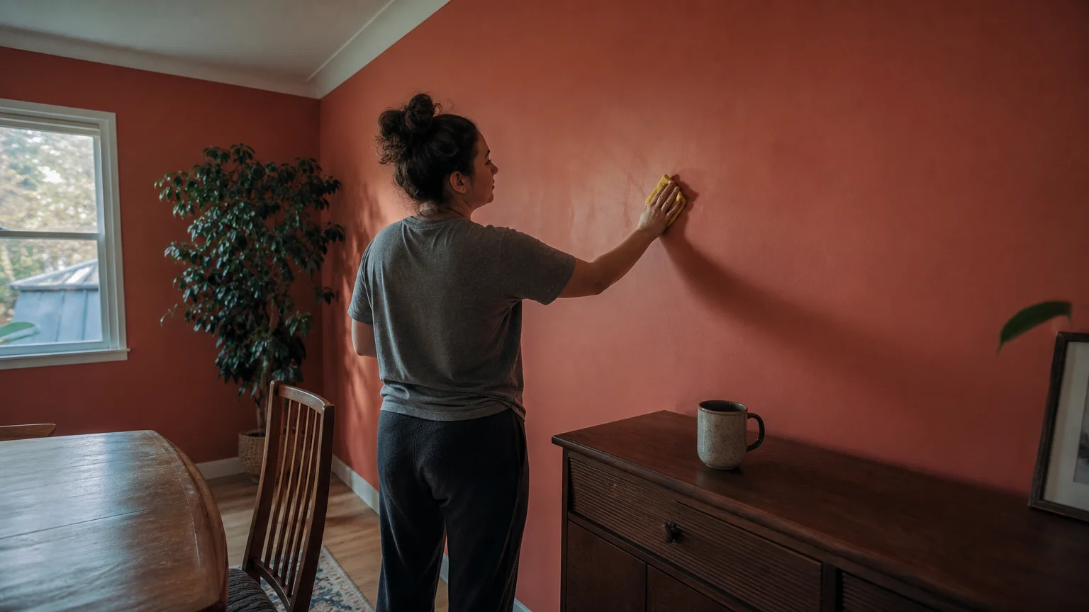
Maintaining the beauty of your newly colored room requires understanding your paint’s sheen. Flat and matte finishes hide wall imperfections beautifully, but they absorb dirt and resist rigorous cleaning. If you used a matte finish to enhance the velvety look of dark colors like chocolate brown or aubergine, you should only clean the walls with a dry microfiber cloth or a very lightly dampened sponge. For higher traffic areas where you opted for an eggshell or satin finish, you can wipe away fingerprints and scuffs using a few drops of dish soap mixed with warm water. Keep a small, airtight mason jar of your leftover paint stored in a climate-controlled area for future touch-ups.
Frequently Asked Questions About Painting North-Facing Rooms
Do I absolutely need to use a warm-toned primer?
Yes; standard white primer can occasionally allow a cool, stark base to influence your topcoat. Using a warm gray or specifically tinted primer provides a neutral foundation that helps your carefully chosen warm hues—like terracotta or mustard—develop their full richness without fighting the stark white underneath.
How do I accurately test paint samples in low light?
You must never paint directly on the wall when testing. Instead, paint two coats of your sample onto a large piece of sturdy poster board. Move this painted board to different walls in the room throughout the day. This method allows you to observe how the shadows and the cool northern light interact with the color during morning, noon, and evening without committing to a permanently patchy wall.
Can I use high-gloss paint to bounce more light around?
While gloss reflects more light, it also highlights every single dent, wave, and imperfection in your drywall. In a dimly lit room, high-gloss paint creates a harsh glare rather than a soft glow. You should rely on an eggshell or satin finish for a subtle sheen, and look into managing interior glare and reflection through strategic placement of mirrors and reflective accent furniture instead.
Will artificial lighting ruin the paint color at night?
Artificial lighting fundamentally changes how your paint reads, but it does not have to ruin it. Standard incandescent bulbs cast a heavy yellow glow, while modern LEDs range from icy blue to warm amber. To keep your unexpected colors looking true to your vision after the sun sets, you should select energy-efficient lighting color temperatures around 3000K, which provides a clean, warm-white light that enhances both deep moody tones and subtle warm neutrals.
Transform Your Shadowy Space Today
Conquering a north-facing room empowers you to break free from uninspired decorating rules and experiment with genuinely impactful design. You hold the ability to turn the coldest, most unwelcoming room in your house into a meticulously curated sanctuary just by altering the chemistry of its light with a fresh coat of paint. Gather your supplies, confidently select a rich, unexpected hue, and start rolling. Your home is ready for a vibrant, masterful transformation; take that crucial first step and claim your weekend project right now.