Do you also make these interior design mistakes?
Interior design is constantly in flux. One day, rattan furniture and white kitchens are all the rage, and the next, we’re embracing plusher, more comforting textures and warm tones. If you’re not paying attention to these tiny changes made over the years, your house may not evolve the way you want it to.
The word “outdated” is a scary term in the interior decorating world. You try to avoid it at all costs, but sometimes trends have a way of sneaking out and leaving you behind to deal with the fallout. The good news is that outdated decor can be updated easily without breaking the bank, as you might think.
Without further ado, here are some interior design mistakes that make your house look dated!
1. Pushing furniture up against walls
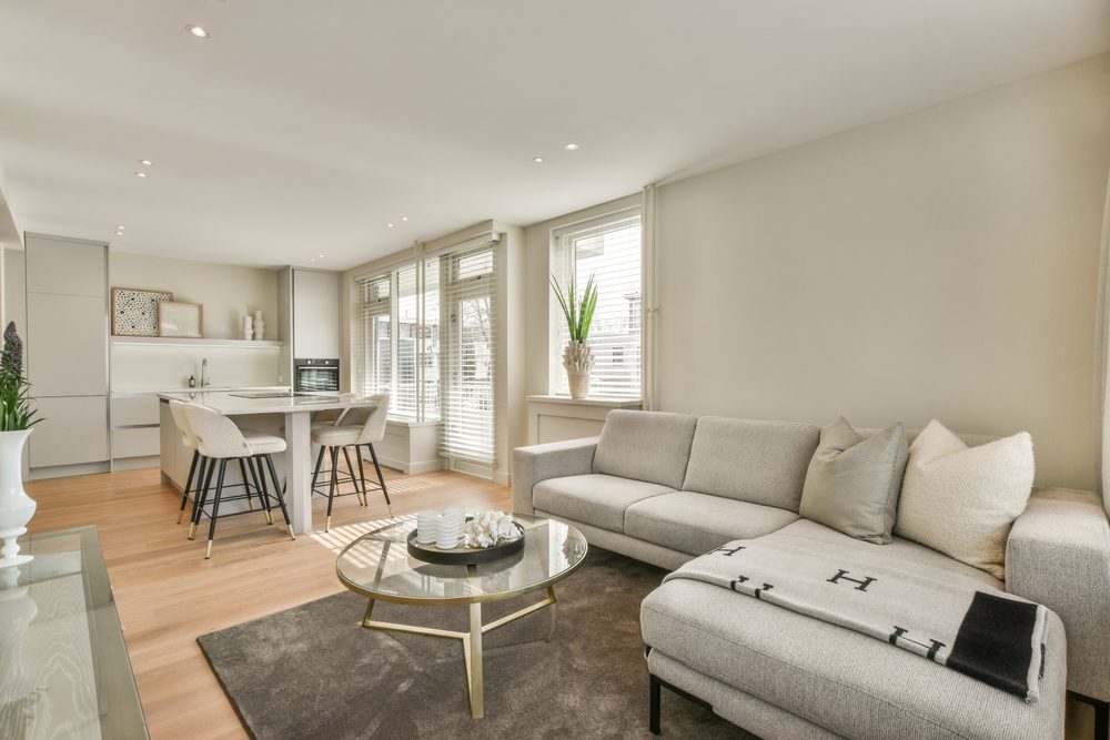
Placing furniture along walls is a common move seen in many houses—and it has been for years—especially since it may feel like it makes the space appear larger. However, using your walls as the anchor point for furniture is one of those interior design mistakes that are dating your house.
You might think that you maximize the space of your room, but this type of layout actually winds up looking unplanned and too spread out. Moreover, it’s not always conducive to conversation. According to interior design experts, pulling furniture into the room allows for a more conversational and intimate furniture plan.
They suggest not being afraid of arranging your furniture items close to each other, within reason. Then, if there’s enough space left, you can place a cabinet or console along the perimeter of the room to create extra storage and more aesthetic interest.
2. Misunderstanding maximalism
Another example of interior design mistakes that are dating your house is when people misunderstand maximalism. Maximalist design is all the rage right now, but today’s iteration takes a more personalized, thoughtful approach.
In other words, having too many little objects on shelves or tables may actually hurt your home’s overall vibe.
According to experts, this is one of those interior design mistakes that arise from overdoing something. A lot of stuff placed around your house can look distracting, disorganized, and busy. Instead, aim to curate your tchotchkes, keeping today’s clustercore trend in mind.
This new home decor technique centers on crafting your home to reflect your pastimes, interests, and way of life. Clustercore involves integrating antiques, art, and personalized objects to curate effortless and authentic moments throughout a home.
3. Sticking to just one design style or era
Mid-century, shabby-chic, or boho pieces are still cool, but sticking to just one design era, style, or movement is one of those interior design mistakes that you may want to avoid if you want your house to look on trend.
If you don’t want your home to feel one-note or too thematic, look for ways to mix multiple design styles, says Julie Brayton, the principal designer at Brayton Interiors. While having a few pieces that speak to these styles is excellent, it’s important to branch out to create visual interest.
Incorporate some great finds from heirlooms or vintage shops, replace on-the-nose pillows with an irreverent print that fits the room style but adds depth and interest, and switch pieces around to create less of a one-note environment—which can feel really stale.
4. Using white-washed wood
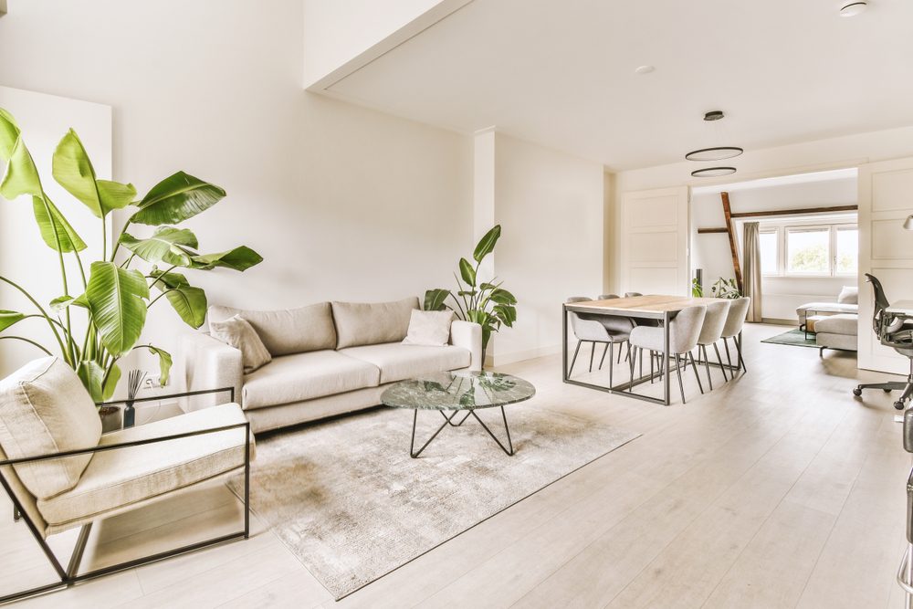
Another example of interior design mistakes that are dating your house is making everything bright, light, and white—including your home’s wood. This was a trend that lasted many years, but now it’s time to mix things up, experts say.
According to Heather Fujikawa, principal designer and co-owner at House Sprucing, white-washed wood is rather outdated and is one of the most common interior design mistakes people make without even knowing it may actually end up not withstanding the test of time.
Right now, experts are looking for ways to add depth that comes back to wood tones and wood stains in all things interior, from wood flooring to furniture legs.
A good mix of wood stains helps to incorporate a layered dimension and makes it feel trendy yet long-lasting at the same time. Fujikawa suggests mixing two to three wood stains in your house to help bring in dimension. The result is a layered look—something white-washed wood just can’t do.
Keep reading to discover other interior design mistakes that are dating your house!
5. Filling up your house with fast finds
According to experts, fast finds are officially an interior designer faux pas. This is pretty common, and most likely you’ve done this as well—you want to feel good about your house, and sometimes you buy furniture and accessories quickly or spontaneously.
Well, you may want to think again before doing that if you want to avoid interior design mistakes that make your house look outdated. Hasty decisions often wind up not withstanding the test of time or working in your space. This being said, you end up collecting lots of pieces for the sake of having them. This can often lead to a stale, inauthentic, and dated feel.
One way to avoid this is by putting a bit more time into your buying choices. Interior designers suggest spending more energy looking for things you love. Find inspiration through research and visit shops to see the items in person if you can. Invest in homewares, either vintage or new, that you like so much that you can see yourself living with them and seeing them for years to come.
6. Purchasing matching furniture sets
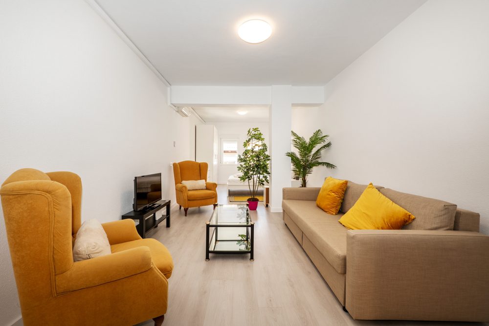
Similar to other interior design mistakes, buying matching furniture sets is something we’ve all done at least once. Many of us have crossed the threshold of a big-box furniture store and walked out of there with a brand new matching set.
Experts say that this may work sometimes, but in most cases, the result is too expected and uniform. They also point out the fact that the design trends right now are all about organic living and making things feel livable and pretty at the same time.
You can still match a set of something without making interior design mistakes—like two occasional chairs or two white sofas in the same silhouette—but take it up a notch by incorporating a unique coffee table with wood stains and different legs.
Do so, and you’ll create an intentional design scheme that feels trendy and stays that way for decades.
7. Taking minimalism too far
Similar to No. 2, taking minimalism too far is one of the interior design mistakes that will not withstand the test of time and make your house look outdated.
You’ve decided that maximalism isn’t for you, but make sure you’re not leaning too far in the other direction—an all-white, extremely minimalist environment is often a cold one. Swinging in layers, warmth, depth, and visual interest is a far better decision, even when you’re working with neutrals.
Let’s get this straight: You don’t have to give up the minimalist aesthetic you love, but you should aim to make your space more inviting. If you’re still loving your cream-colored environment, consider a texture change.
For example, a simple way to spruce up white walls is to add a gentle texture with a light lime plaster or wash on the walls and ceilings. Another way to breathe new life into a minimalist space would be to add flowing open-weave drapery, vintage pottery with striking oversized branches, or natural organic lighting (warm bulbs only; you can find some options here).
Bringing in layers for texture and warmth creates depth when styling and gives a whole new life to a streamlined and clean environment.
If you liked our article on interior design mistakes, you may also want to read Boring TV Wall? Not With These 10 Genius AND Cheap Hacks!


