Paint is one of the easiest and most cost-effective ways to transform a home’s appearance. A fresh coat of paint can make a space feel brand new, clean, and even bigger. But as powerful as paint can be, it can also work against you if used incorrectly. Some common paint mistakes can actually make your home look smaller, more cluttered, or even claustrophobic, exactly the opposite of what most homeowners want.
In this article, we’ll uncover the most common paint-related errors that shrink your space visually and what you can do instead to create a home that feels bigger, brighter, and more inviting. Whether you’re repainting a single room or refreshing your entire house, understanding these key concepts can help you avoid costly and frustrating mistakes.

1. Using Dark Colors in Small or Low-Light Spaces
Dark colors can be dramatic, moody, and stylish, but when used incorrectly, they can make rooms feel cramped and oppressive. Small rooms with little natural light are especially vulnerable. Dark colors absorb light rather than reflecting it. In spaces with minimal sunlight or artificial lighting, this can make the walls close in, reducing the perceived size of the room.
If you love dark colors, use them as accents on a feature wall, in furniture, or through decor. For the main wall color, opt for light neutrals like soft grays, warm whites, or pale pastels. These shades reflect light and help open up the space visually.
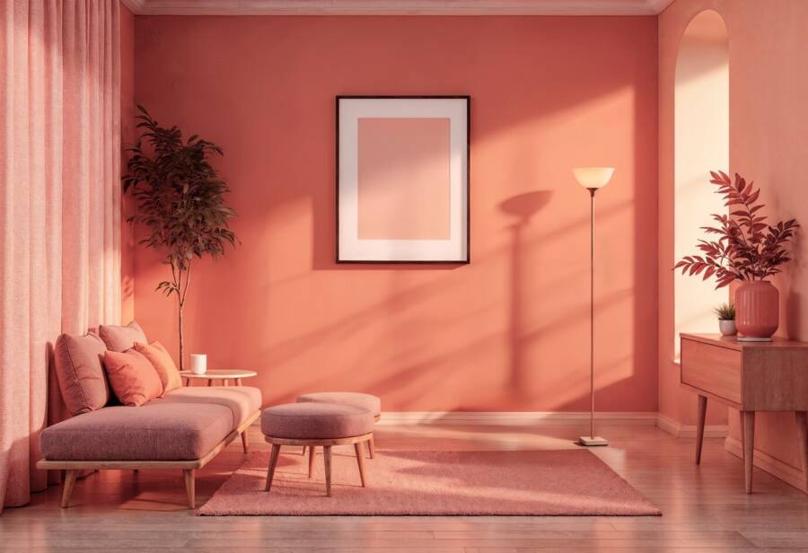
2. Painting the Ceiling the Wrong Color
Many people overlook the ceiling, assuming it doesn’t play a significant role in the look and feel of a room. But painting your ceiling the wrong color or leaving it out entirely can have a huge impact on how big or small your space feels. Painting the ceiling a dark or bold color can make it feel lower, creating a cave-like effect. Even painting it the same color as the walls, especially in a darker tone, can visually close in the room.
Instead, you should stick with bright white or a very light neutral for ceilings. A white ceiling bounces light around the room and draws the eye upward, creating the illusion of height and airiness.
3. Overusing Bold Accent Walls
Accent walls are a popular way to add personality and style. But when done poorly or too often, they can do more harm than good. A dark or intensely colored accent wall in a small room can feel overpowering and can visually reduce the depth and width of the space. In some layouts, it can also create imbalance, making the room feel awkwardly shaped.
Use accent walls thoughtfully. In smaller spaces, choose a wall that receives plenty of natural light, and opt for a color that contrasts gently with the rest of the room. Stick to soft, muted tones that add interest without overwhelming the space.
4. Choosing the Wrong Undertone
Many homeowners make the mistake of selecting a paint color without considering its undertone. A color might look beige, grey, or white in the can, but on the wall, it might read as green, pink, or purple, depending on lighting and surrounding colors. Clashing undertones can make a room feel off-balance or visually busy, even if the walls are light. This confusion can overwhelm the eye and make a space feel tighter and more chaotic.
Always test paint samples in your space and observe them at different times of the day. Consider existing elements in the room like flooring, cabinets, and furnishings to ensure the undertones complement one another. Sticking to a harmonious palette keeps the space feeling open and cohesive.
5. Using Too Many Different Paint Colors in One Area
It can be tempting to give each room its own personality by using a different color, but this can backfire, especially in smaller homes. When every room has a drastically different color scheme, it creates visual breaks. Instead of a natural flow, the eye stops and starts at each transition, making the whole home feel chopped up and more confined.
Use a consistent color palette throughout the home, especially in open-concept layouts. You don’t have to paint every wall the exact same color, but sticking with different shades of the same base tone, like soft grays, warm taupes, or light blues, helps create visual continuity and a sense of a bigger space.
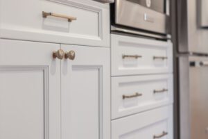
6. Ignoring Trim and Molding Colors
Trim and molding often get an automatic coat of white paint, but not all whites are created equal, and skipping over these details can make your room feel flat. When trim blends into the wall color or looks too stark in contrast, it can confuse the eye and break the line of sight. Poorly chosen trim colors can make ceilings appear lower and walls shorter.
Use trim to your advantage. A crisp, clean white with a satin or semi-gloss finish can help define the space and reflect light. Painting trim slightly lighter than the wall color can also create the illusion of larger walls and higher ceilings.
7. Glossy Finishes in the Wrong Places
Glossy paint reflects more light and can make colors appear more vibrant, but using high gloss in the wrong areas can have the opposite effect. Glossy finishes show every imperfection and can bounce light in harsh ways, especially in tight spaces. This can create glare and draw attention to uneven surfaces, making the room feel more cluttered and less cohesive.
Reserve high-gloss finishes for small accents like doors or trim. For walls, stick with eggshell, satin, or matte finishes, which diffuse light more softly and help create a smoother, more open appearance.
8. Using Cool Colors in Warm Lighting
Paint colors can look completely different depending on the lighting. Using a cool-toned paint in a room with warm yellow lighting, or vice versa, can cause visual imbalance. This kind of clash created discomfort for the eye, making the space feel out of sync and more confined. Instead of feeling open and balanced, the room may feel off or poorly lit.
Match your paint colors to the lighting. If your room gets a lot of warm sunlight or has warm-toned bulbs, opt for paint colors with warm undertones. For cooler, whiter light, choose colors with cooler undertones like soft grays or muted blues.
9. Not Considering the Floor Color
Paint color doesn’t exist in isolation. The color and material of your flooring can drastically affect how your wall colors look. Dark or heavy patterned floors combined with poorly chosen wall colors can pull the room downward, making it feel bottom-heavy and closed in.
Coordinate your wall color with your floors. Light-colored walls paired with light to medium-tone floors help create a visual lift. If you have dark floors, balance them with brighter walls and plenty of natural or artificial lighting.
10. Skipping Paint Altogether
Some people avoid painting altogether out of fear of making a mistake, sticking with outdated or builder-grade beige walls that do nothing to enhance the space. Old, dingy, or mismatched walls can make a room feel neglected and closed in. Lack of intentional design reduces visual flow and harmony.
Don’t be afraid of paint, it’s one of the easiest ways to improve a space! Even a simple refresh with a soft, neutral color can breathe life into a room and make it feel larger, cleaner, and more cohesive.
Want to learn more about interior design? If the answer is “yes,” then we recommend reading this book.
Read also: THIS Is How You Should Paint a Room